 Creative Director Chanone Smith oozes class and sophistication in everything she does. Of course, she needed a fashion forward identity and stationery package to reflect that.
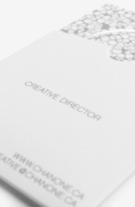
Inspired by fashion institutions, this has to be one of our favourite print jobs yet. The simple yet bold ‘C’ mark with the missing fragment is memorable and elegant. Her wordmark is no different, and places emphasis on the ‘Chanone’ to encourage clients to call her by her first name. An organic, animal print inspired pattern creates visual texture and interest against the main, crisp white background linking the stationery pieces together and adding another level of detail to her package. Custom stickers to seal the envelopes, metallic foils and a velvety laminated finish add tactile impressions to this stunning identity.
Please visit the identity and print galleries of our website to see the complete project.