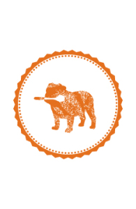
 Some of our favourite clients, the owners of the Village, asked us to help them create a secondary logo for their branding. They wanted something with no text that really spoke to the personality of the restaurant.
We opted to maintain the distressed look of the primary logo and map designs, as well as the vibrant burnt orange to keep a strong connection. A popular framed photograph of the owner’s bulldog in the restaurant quickly became a source of inspiration. But how do we make the leap from bulldog to breakfast you ask? Well obviously, the dog is hungry for their delicious benny’s too – and with the addition of a spoon in the dog’s mouth and bold patterns to create focus, a secondary logo was born.
You will see this graphic used more prominently in the new Village we are working on in Royal Oak, and the Village team already loves it so much that they are using it in all new graphics and their social media!
Check out the restaurant interior design project and what did for their branding and graphics design.
