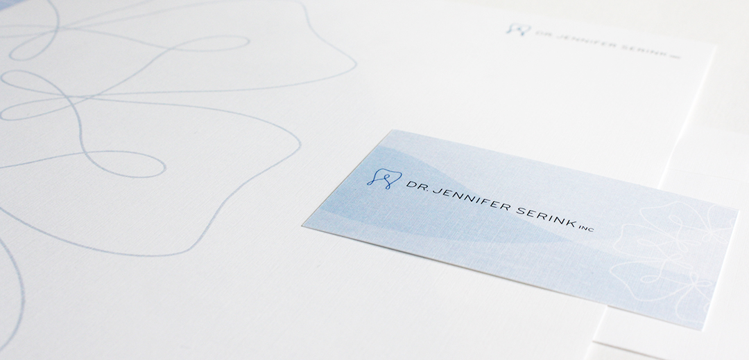
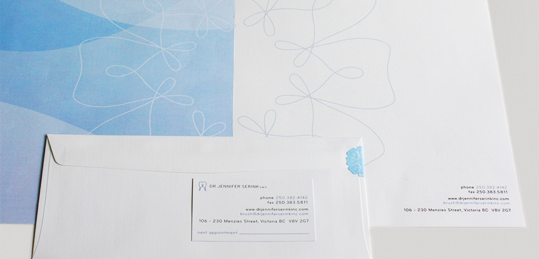
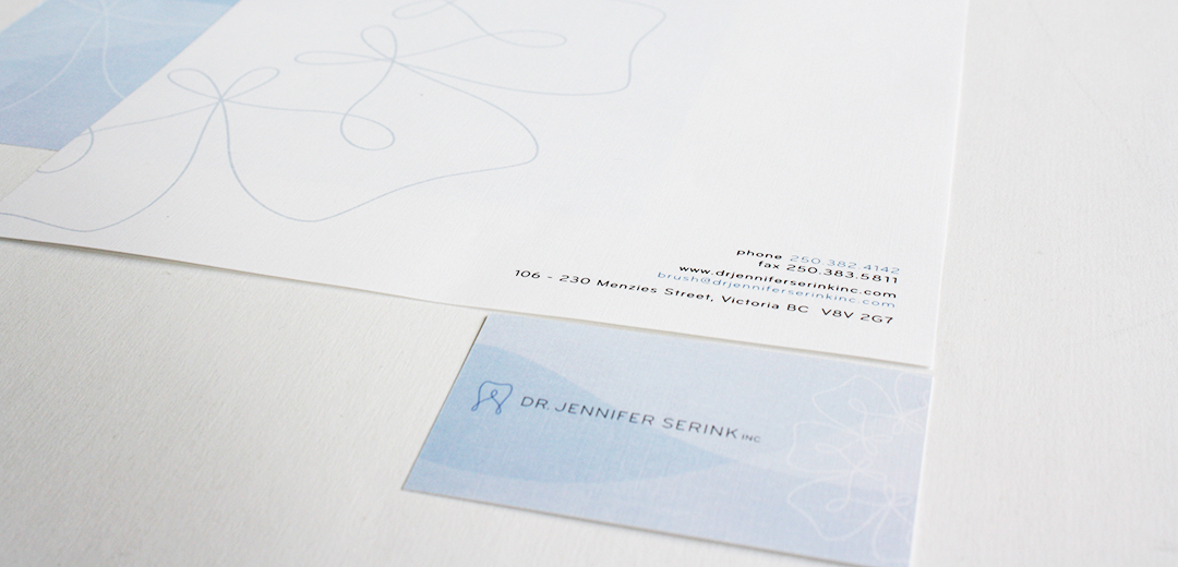
Dr. Jennifer Serink
Victoria-based dentist, Jennifer Serink was looking for a clean and family-friendly logo. She specifically requested something that would be professional, but entice kids so they would not be afraid of the dentist. The sweeping playful lines of the tooth mark in combination with the simple, curved lines of the typography fit the bill perfectly.
This concept was applied in various blue tones throughout the stationery package and website to present the practice as clean and calm. A circular pattern repeat was also introduced using the mark.