 Reel Life Charters is a (cleverly named) new fishing charter business based out of Sooke, BC. A brief journey from downtown Victoria, delivers an amazing marine experience.
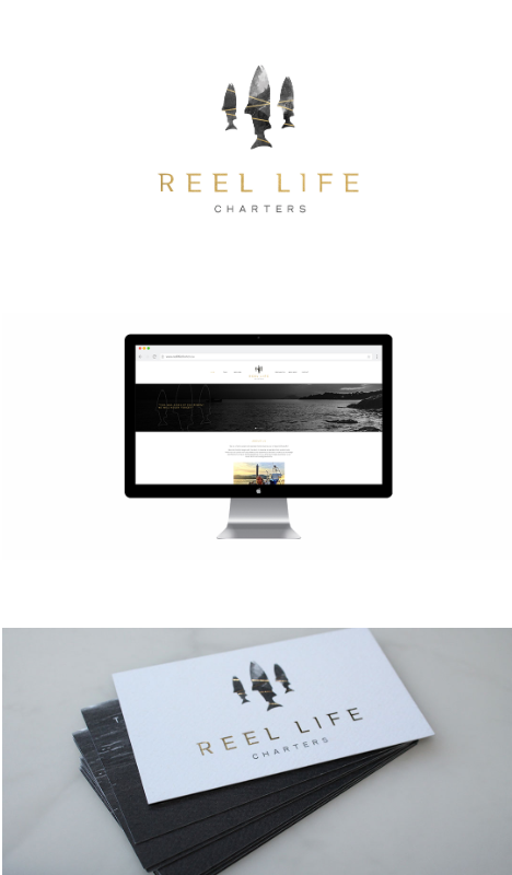
Reel Life Charters asked Meade Design Group to design a logo brand for the company that was both west coast inspired and refined. We applied a unique grey-scale texture, withintersecting gold bars to 3 Chinook salmon, making the logo mark stand out boldly. The typography is simple, but is both a subtle mixture of classical serif fonts and sans serif fonts, making it contemporary and distinctive.
We foiled the salmon with gold foil on top of a rough textured business card, making the final product truly elegant. Accompanying the beautiful business cards, Travis asked us to design the website, gift certificates, thank you cards, and water bottle labels that he can give out to fishing clients.
Feel free to checkout the website for yourself at: reellifecharters.ca to see some of our work in action, and be sure to check them out for your next adventure fix!
Oct 1, 2016 | Project Updates
 7070 Design Headquarters is a new studio that has just launched in Calgary, Alberta. It is a place designers can go to use the resource library, hold meetings, and even rent out office space. A shared work space for Calgary’s design community.
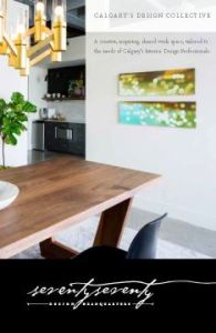
We were approached for our graphic design services by seventyseventy who were looking for something classic and sophisticated – yet adaptable, allowing designers with their own identities to fit right in. We went with a typographical solution that has an understated detail with the seemingly handwritten font – the final line entices your eye to follow it throughout the e-brochure, business card and website. The elegantly versatile aesthetic was carried through with an colour scheme of black, white and gold.
We just launched the seventyseventy website, check it out today at http://7070.ca to see what 7070 has to offer.
Jan 25, 2013 | Project Updates
 This is quite possibly our most fashion forward logo yet.
We were thrilled when international handbag designer Meg De Candia asked Meade Design Group to help her re-brand herself with a new logo, business cards, and an invitation/brochure design.
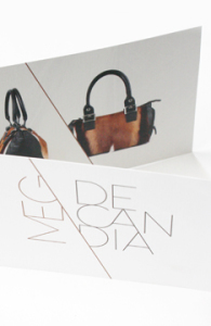
We wanted to create a look that would hold it’s own against heavy-weight brands such as Calvin Klein, Michael Kors, Balenciaga and Kate Spade. Not to toot our own horn, but we think we did with this clean but edgy logo with stong diagonal lines, juxtaposed directions and stacked typography. The logo also lent itself to a stunning use of repetition with her images and a beautiful custom pattern that was used inside the business cards and layered onto the image at the back of the brochure with a detail shot of the gorgeous hides she uses in her designs.
Please visit the identity and print galleries to see the complete project.
Sep 30, 2011 | Project Updates
 Reel Life Charters is a (cleverly named) new fishing charter business based out of Sooke, BC. A brief journey from downtown Victoria, delivers an amazing marine experience.
 7070 Design Headquarters is a new studio that has just launched in Calgary, Alberta. It is a place designers can go to use the resource library, hold meetings, and even rent out office space. A shared work space for Calgary’s design community.
 This is quite possibly our most fashion forward logo yet.