 It’s been a long time since our last newsletter, but that doesn’t mean we haven’t been up to exciting things. This has been another year of stimulating travel, new projects, candle releases and much more!
Read on to catch up on all the latest news and gossip with Meade Design Group in the Summer 2018 MDG Times.
As always, we look forward to your feedback – so feel free to get social with our newsletter!
THE MDG TIMES – NO.13
Jun 5, 2018 | Home, Studio News, The MDG Times
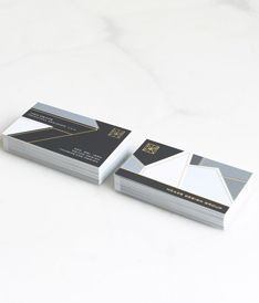 Meade Design Group has a new look! We’ve re-designed our business cards, our website, and even applied new signage to our studio.
Sep 13, 2017 | Studio News
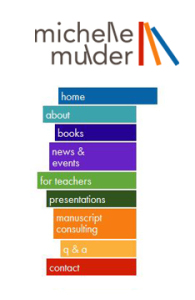 We were so happy to get the call from a dear friend of Meade Design Group, Mrs. Michelle Mulder, when she wanted a new look for her website.
We knew Michelle’s image would have to be fun and kid friendly (she is a children’s author), but maintain a professional look for the teachers and parents that would be using her website for resource materials, or for the professional clients who hire Michelle for manuscript consulting and copy writing.
We created a playful, abstracted version of a bookshelf in primary colours inspired by the series of vertical lettering in her name and continued the concept for the website’s menu.
We’ve posted her logo in our web and identity portfolios, but definitely check her website out for yourself at: http://www.michellemulder.com/
Jun 20, 2012 | Project Updates
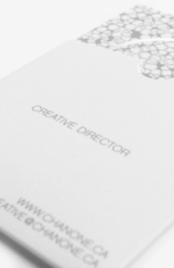 Creative Director Chanone Smith oozes class and sophistication in everything she does. Of course, she needed a fashion forward identity and stationery package to reflect that.
Inspired by fashion institutions, this has to be one of our favourite print jobs yet. The simple yet bold ‘C’ mark with the missing fragment is memorable and elegant. Her wordmark is no different, and places emphasis on the ‘Chanone’ to encourage clients to call her by her first name. An organic, animal print inspired pattern creates visual texture and interest against the main, crisp white background linking the stationery pieces together and adding another level of detail to her package. Custom stickers to seal the envelopes, metallic foils and a velvety laminated finish add tactile impressions to this stunning identity.
Please visit the identity and print galleries of our website to see the complete project.
Feb 22, 2012 | Project Updates
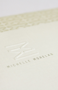 Michelle is a fellow designer that we already knew and loved, so when she approached us to design a new identity for her including logo, stationery, social media and website, we were thrilled.
Embracing Michelle’s personality and aesthetic, we created an identity that was warm, modern and clean – yet natural. Michelle Morelan Design is known for it’s West Coast Contemporary and nature-inspired interiors, as well as stunning renderings. The reflected ‘Double M’ used in her mark has been well received as both a bold, modern statement, and as evoking the natural reflections in the lakes and oceans Michelle experienced throughout her life living on the West Coast. This mark lends itself prefectly to creating gemoetric patterns and coupled with the taupes and charcoals we chose, fits Michelle’s style perfectly.
To learn more about Michelle Morelan Design, please visit the website: here
Jan 13, 2012 | Project Updates
 It’s been a long time since our last newsletter, but that doesn’t mean we haven’t been up to exciting things. This has been another year of stimulating travel, new projects, candle releases and much more!

 We were so happy to get the call from a dear friend of Meade Design Group, Mrs. Michelle Mulder, when she wanted a new look for her website.
 Creative Director Chanone Smith oozes class and sophistication in everything she does. Of course, she needed a fashion forward identity and stationery package to reflect that.
 Michelle is a fellow designer that we already knew and loved, so when she approached us to design a new identity for her including logo, stationery, social media and website, we were thrilled.