 Michelle is a fellow designer that we already knew and loved, so when she approached us to design a new identity for her including logo, stationery, social media and website, we were thrilled.
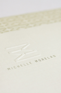
Embracing Michelle’s personality and aesthetic, we created an identity that was warm, modern and clean – yet natural. Michelle Morelan Design is known for it’s West Coast Contemporary and nature-inspired interiors, as well as stunning renderings. The reflected ‘Double M’ used in her mark has been well received as both a bold, modern statement, and as evoking the natural reflections in the lakes and oceans Michelle experienced throughout her life living on the West Coast. This mark lends itself prefectly to creating gemoetric patterns and coupled with the taupes and charcoals we chose, fits Michelle’s style perfectly.
To learn more about Michelle Morelan Design, please visit the website: here
Jan 13, 2012 | Project Updates
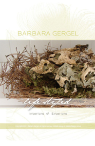 Barbara Gergel is a very talented and recognized local stylist. From residential to landscape design, Barbara’s ability to mix styles, deep knowledge of the design elements and a clear understanding of her clients needs are evident in each of her projects. Barbara’s designs have always been characterized by the elegance of their lines and a sense of uniqueness. Her work is often transitional with a perfect blend of classic and contemporary elements.
We created a design which we feel exudes class, flair and elegance with the use of a swooping peacock feather, clean typography, metallic inks and a chartruse colour palette which has been used on business cards and a one-page website.
Please visit Barb’s website at http://www.barbaragergel.ca/ and the identity, print and web galleries of our website to see the complete project.
Nov 14, 2011 | Project Updates
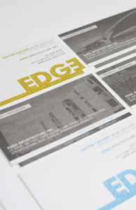 We cannot wait to share our most recent stationery and website package with you – Edge Architecture.
Founder of Edge Architecture Gaston Castaño [Maibc] came to Meade Design Group for an identity that would appeal to his design-conscious clientele. His company mantra? “The name EDGE recognizes the firm’s goal to provide a competitive edge to design practices that want to add value to their project deliverables”.
We went for it, with a bold lettering style and bleed that is most certainly eye-catching. The stationery was printed in four colours to maximize the punchiness of the Edge brand, and even features a die-cut to enhance the unique feature of the offset lettering within the logo. For more details go here.
To learn more about Gaston Castaño and his firm, please check out his website at: http://edge-arch.com/
Sep 22, 2011 | Project Updates
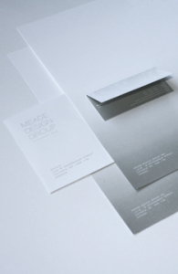 To celebrate the renewal of Meade Design Group we have created a new image for the business, one that embraces our old branding (with the repetition of the horse image and typography of our logo), but also symbolizes our growth and evolution with the use of the gradient and layering of patterns and forms.
We also warmed up our colour palette and softened the lines to better represent our warm and friendly working environment. Now that we have put so much work into our networking and accessibility, we wanted to reflect that in our image; we want to be perceived as professionals who are young, fun, and love what we do – design really is our passion!
Mar 10, 2011 | Studio News