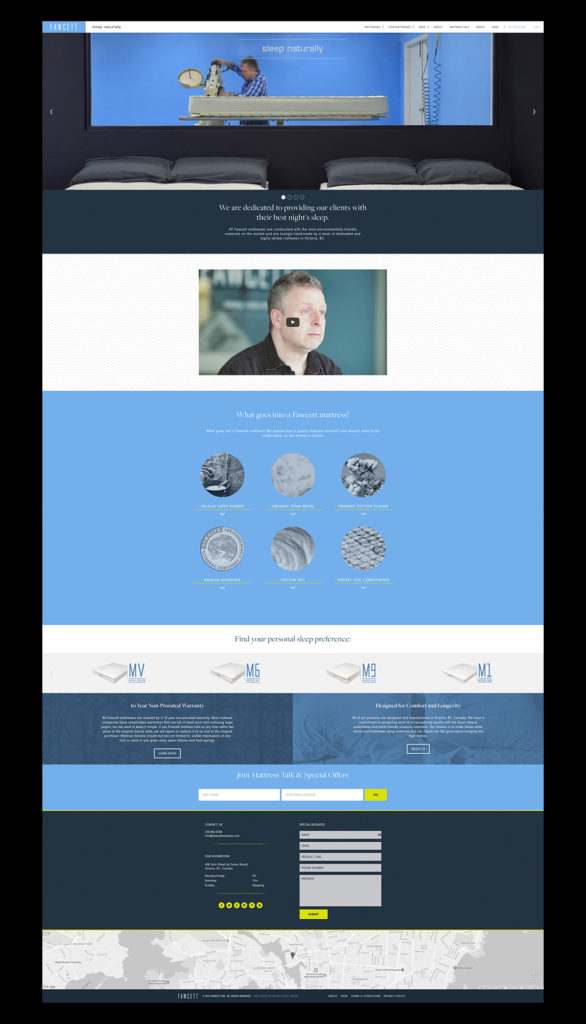
 Well known furniture and mattress manufacturers (and repeat clients), Fawcett contacted Meade Design Group earlier this year for a redesign of their website which included an online store. The process was fun and we are so pleased with the clean results that work so well with their aesthetic.
Business is certainly shifting more and more towards e-commerce, so if your business is in need of a boost to their online presence, get in touch with us and we would be happy to discuss some options with you to get you to the top of your competition with a website that is easy to navigate, visually appealing and on-brand.
Check out the finished site here: fawcettmattress.com and take a tour of their latest updates and product offerings.
Dec 1, 2016 | Project Updates
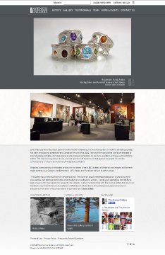 Take a peek at The Avenue Gallery’s new look at: theavenuegallery.com courtesy of Meade Design Group!
We updated one of Victoria BC’s best art galleries with a new site which makes updating (thanks to CMS via WordPress) and online purchasing (e-commerce) a breeze. With these great new features, we have also made the website responsive, meaning that it looks just as great on smart phones, tablets and small screens as it does on larger screens.
The new look is subtle and clean. The greyscale palette allows all of the artwork to pop while maintaining an unobtrusive and contemporary aesthetic.
We are excited to enable The Avenue Gallery to extend their reach beyond Oak Bay Avenue to the rest of BC, Canada, and indeed the world wide web.
Jul 5, 2014 | Project Updates
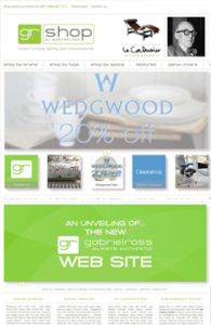 How cool is it that we were able to help one of our favourite stores re-brand themselves? We were thrilled to get the call from Ross Taylor, owner of Gabriel Ross, to help him create a new image/site for his online store, now known as GR Shop. Check out the website for yourself at: http://grshop.com/!
One of the most important factors in this project was maintaining a recognizeable connection to the old image, since Gabriel Ross has a large client base spread across the country. The other key element was the navigation. There is a lot of information on this site on a lot of different product types, so it was important to maintain consistency in how to access and display this information, as well as explore the entire site with ease – there’s more than just products for sale here, there’s a blog, and the ability to create wish lists and gift registries. With all that in mind, we also had to consider that this was also an e-commerce and content management site – which made the programming far more in depth.
Aug 16, 2012 | Project Updates
 Well known furniture and mattress manufacturers (and repeat clients), Fawcett contacted Meade Design Group earlier this year for a redesign of their website which included an online store. The process was fun and we are so pleased with the clean results that work so well with their aesthetic.
 Take a peek at The Avenue Gallery’s new look at:
  How cool is it that we were able to help one of our favourite stores re-brand themselves? We were thrilled to get the call from Ross Taylor, owner of Gabriel Ross, to help him create a new image/site for his online store, now known as GR Shop. Check out the website for yourself at: