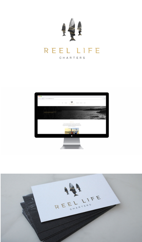
 Reel Life Charters is a (cleverly named) new fishing charter business based out of Sooke, BC. A brief journey from downtown Victoria, delivers an amazing marine experience.
Reel Life Charters asked Meade Design Group to design a logo brand for the company that was both west coast inspired and refined. We applied a unique grey-scale texture, withintersecting gold bars to 3 Chinook salmon, making the logo mark stand out boldly. The typography is simple, but is both a subtle mixture of classical serif fonts and sans serif fonts, making it contemporary and distinctive.
We foiled the salmon with gold foil on top of a rough textured business card, making the final product truly elegant. Accompanying the beautiful business cards, Travis asked us to design the website, gift certificates, thank you cards, and water bottle labels that he can give out to fishing clients.
Feel free to checkout the website for yourself at: reellifecharters.ca to see some of our work in action, and be sure to check them out for your next adventure fix!
Oct 1, 2016 | Project Updates
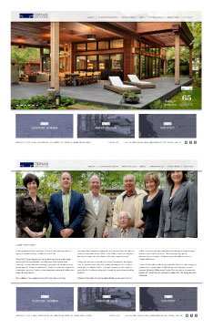 Take a peek at Tidman Construction’s new online look at: www.tidmangroup.com courtesy of Meade Design Group!
65 years young and third generation family business, Tidman Construction was in need of an updated website. We made use of a CMS via WordPress which makes real-time updates super easy for their staff. With these great new features, we have also made the website responsive, meaning that it looks just as great on smart phones, tablets and small screens as it does on larger screens.
Tidman construction wanted something that would reflect the timeless quality of their work. The design is clean yet classic and very easy to navigate with subtle branding throughout.
Feb 13, 2015 | Project Updates
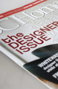 White is classic, yet strikingly modern. How can you achieve that beautiful, gallery inspired space with crisp white walls without looking stark or sterile?
BC Home to the rescue!
Our principal, Ivan Meade, has been interviewed for the latest issue of BC Home’s article “Fresh Whites” (page 109) alongside very talented fellow designers Patricia Gray and Valerie Edwards. You are sure to find the answers to any of your white questions within the pages of this story.
As always, we were very pleased to have our input featured in this great magazine. The text by Catherine Tse was a pleasure to read and the layout and photography is stunning as always.
For photographs of projects where we have used white in our designs, check out our Interior Design portfolio and take a look at Spring Bay and Persimmon Drive in particular.
Sep 8, 2011 | Studio News
 Reel Life Charters is a (cleverly named) new fishing charter business based out of Sooke, BC. A brief journey from downtown Victoria, delivers an amazing marine experience.
 Take a peek at Tidman Construction’s new online look at:
  White is classic, yet strikingly modern. How can you achieve that beautiful, gallery inspired space with crisp white walls without looking stark or sterile?