Meade Design Group Rebrand!
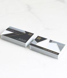 Meade Design Group has a new look! We’ve re-designed our business cards, our website, and even applied new signage to our studio.
 Meade Design Group has a new look! We’ve re-designed our business cards, our website, and even applied new signage to our studio.
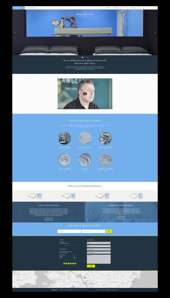 Well known furniture and mattress manufacturers (and repeat clients), Fawcett contacted Meade Design Group earlier this year for a redesign of their website which included an online store. The process was fun and we are so pleased with the clean results that work so well with their aesthetic.
Business is certainly shifting more and more towards e-commerce, so if your business is in need of a boost to their online presence, get in touch with us and we would be happy to discuss some options with you to get you to the top of your competition with a website that is easy to navigate, visually appealing and on-brand.
Check out the finished site here: fawcettmattress.com and take a tour of their latest updates and product offerings.
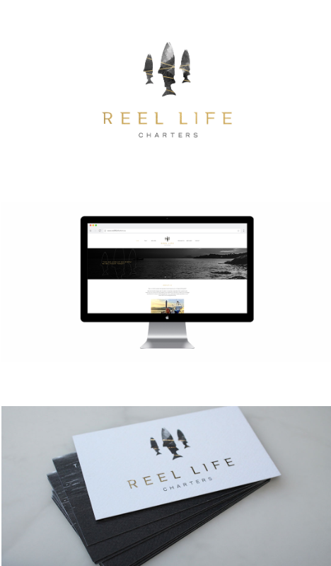 Reel Life Charters is a (cleverly named) new fishing charter business based out of Sooke, BC. A brief journey from downtown Victoria, delivers an amazing marine experience.
Reel Life Charters asked Meade Design Group to design a logo brand for the company that was both west coast inspired and refined. We applied a unique grey-scale texture, withintersecting gold bars to 3 Chinook salmon, making the logo mark stand out boldly. The typography is simple, but is both a subtle mixture of classical serif fonts and sans serif fonts, making it contemporary and distinctive.
We foiled the salmon with gold foil on top of a rough textured business card, making the final product truly elegant. Accompanying the beautiful business cards, Travis asked us to design the website, gift certificates, thank you cards, and water bottle labels that he can give out to fishing clients.
Feel free to checkout the website for yourself at: reellifecharters.ca to see some of our work in action, and be sure to check them out for your next adventure fix!
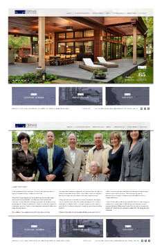 Take a peek at Tidman Construction’s new online look at: www.tidmangroup.com courtesy of Meade Design Group!
65 years young and third generation family business, Tidman Construction was in need of an updated website. We made use of a CMS via WordPress which makes real-time updates super easy for their staff. With these great new features, we have also made the website responsive, meaning that it looks just as great on smart phones, tablets and small screens as it does on larger screens.
Tidman construction wanted something that would reflect the timeless quality of their work. The design is clean yet classic and very easy to navigate with subtle branding throughout.
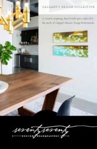 7070 Design Headquarters is a new studio that has just launched in Calgary, Alberta. It is a place designers can go to use the resource library, hold meetings, and even rent out office space. A shared work space for Calgary’s design community.
We were approached for our graphic design services by seventyseventy who were looking for something classic and sophisticated – yet adaptable, allowing designers with their own identities to fit right in. We went with a typographical solution that has an understated detail with the seemingly handwritten font – the final line entices your eye to follow it throughout the e-brochure, business card and website. The elegantly versatile aesthetic was carried through with an colour scheme of black, white and gold.
We just launched the seventyseventy website, check it out today at http://7070.ca to see what 7070 has to offer.