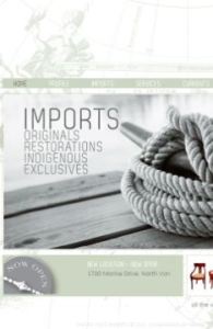
 We were thrilled to work with Michelle Annette Kelava-Juszczyk on her unique business, Pacific Post Imports. A pop-up shop which brings in one-of-a-kind finds from all over the world, curated by Michelle herself who has been in the design industry for over 20 years. We’ll be adding Pacific Post’s print work soon, but in the meantime you can satiate your curiosity by checking out the website for yourself at: www.pacificpostimports.com!
In the end, we think the project as a whole reflects Pacific Post beautifully. A serene West-Coast inspired colour palette with an abundance of nautical references to help visitors imagine the travels these pieces have been on. From a technical perspective, this site works great for the business as well. It is CMS, meaning Michelle is able to update and manage the site herself with ease – very important in a business like hers since inventory can change daily.
Check out Pacific Post today, we can’t wait to see where they pop up next!
Nov 13, 2012 | Project Updates
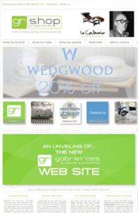 How cool is it that we were able to help one of our favourite stores re-brand themselves? We were thrilled to get the call from Ross Taylor, owner of Gabriel Ross, to help him create a new image/site for his online store, now known as GR Shop. Check out the website for yourself at: http://grshop.com/!
One of the most important factors in this project was maintaining a recognizeable connection to the old image, since Gabriel Ross has a large client base spread across the country. The other key element was the navigation. There is a lot of information on this site on a lot of different product types, so it was important to maintain consistency in how to access and display this information, as well as explore the entire site with ease – there’s more than just products for sale here, there’s a blog, and the ability to create wish lists and gift registries. With all that in mind, we also had to consider that this was also an e-commerce and content management site – which made the programming far more in depth.
Aug 16, 2012 | Project Updates
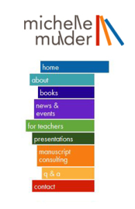 We were so happy to get the call from a dear friend of Meade Design Group, Mrs. Michelle Mulder, when she wanted a new look for her website.
We knew Michelle’s image would have to be fun and kid friendly (she is a children’s author), but maintain a professional look for the teachers and parents that would be using her website for resource materials, or for the professional clients who hire Michelle for manuscript consulting and copy writing.
We created a playful, abstracted version of a bookshelf in primary colours inspired by the series of vertical lettering in her name and continued the concept for the website’s menu.
We’ve posted her logo in our web and identity portfolios, but definitely check her website out for yourself at: http://www.michellemulder.com/
Jun 20, 2012 | Project Updates
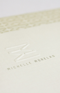 Michelle is a fellow designer that we already knew and loved, so when she approached us to design a new identity for her including logo, stationery, social media and website, we were thrilled.
Embracing Michelle’s personality and aesthetic, we created an identity that was warm, modern and clean – yet natural. Michelle Morelan Design is known for it’s West Coast Contemporary and nature-inspired interiors, as well as stunning renderings. The reflected ‘Double M’ used in her mark has been well received as both a bold, modern statement, and as evoking the natural reflections in the lakes and oceans Michelle experienced throughout her life living on the West Coast. This mark lends itself prefectly to creating gemoetric patterns and coupled with the taupes and charcoals we chose, fits Michelle’s style perfectly.
To learn more about Michelle Morelan Design, please visit the website: here
Jan 13, 2012 | Project Updates
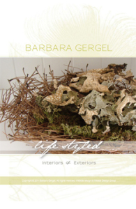 Barbara Gergel is a very talented and recognized local stylist. From residential to landscape design, Barbara’s ability to mix styles, deep knowledge of the design elements and a clear understanding of her clients needs are evident in each of her projects. Barbara’s designs have always been characterized by the elegance of their lines and a sense of uniqueness. Her work is often transitional with a perfect blend of classic and contemporary elements.
We created a design which we feel exudes class, flair and elegance with the use of a swooping peacock feather, clean typography, metallic inks and a chartruse colour palette which has been used on business cards and a one-page website.
Please visit Barb’s website at http://www.barbaragergel.ca/ and the identity, print and web galleries of our website to see the complete project.
Nov 14, 2011 | Project Updates