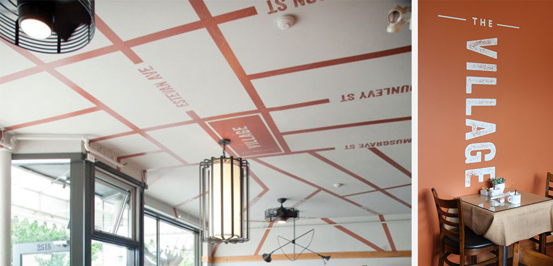
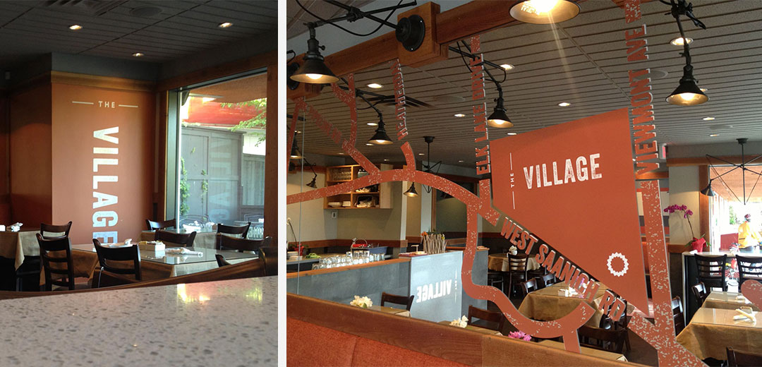
Luisa and Rene

Luisa & Rene

As a new high-end real estate firm, Luisa and Rene needed an elegant and professional image to introduce themselves to the Victoria real estate market. Meade Design Group opted for soft, warm tones with a sophisticated, metallic flair. The result is approachable yet polished, and highly effective. The logo itself has a classic, linear typeface paired with casual lowercase initials with a sweeping detail which is suggestive of the soothing waves experienced by the local island dwellers, or those interested in becoming one.

want what they've got?

Danisha Drury

Danisha Drury

Interior designer and owner of Victoria’s Design District Studios, Danisha Drury asked Meade Design Group to help her create a logo that would reflect her cheerful, fun and stylish personality. Danisha is not afraid of colour, and loves ‘bling’, but she also needed to be presented as an expert in her field, with a careful balance of panache and professionalism.

A fashion-inspired font was used to represent the classic professionalism in both the word-mark and the symbol (which is comprised of four ‘D’s), and the fun and artistry was infused with a watercolour texture in a multitude of colours to offset the formal charcoal text. The texture was also used throughout the print media and other branding.

want what they've got?

Chanone Smith

Chanone Smith

Creative Director Chanone Smith oozes class and sophistication in everything she does and was in need of a fashion forward identity and stationery package to reflect that.

Inspired by fashion institutions, the simple yet bold ‘C’ mark with the missing fragment is memorable and elegant. Her word-mark is no different, and places emphasis on the ‘Chanone’ to encourage clients to call her by her first name. An organic, animal print inspired pattern creates visual texture and interest against the main, crisp white background linking the stationery pieces together and adding another level of detail to her package. Custom stickers to seal the envelopes, metallic foils and a velvety laminated finish add tactile impressions to this stunning identity.

want what they've got?

The Village

The Village

This Oak Bay restaurant was a local favourite for many years. the Village’s new owners wanted to maintain the clientèle, but also aimed to draw in a younger crowd with a more relaxed, contemporary feel. Meade Design Group was very excited to combine its graphic and interior design services into one project.

Drawing inspiration from the restaurant’s moniker, Meade Design Group used a customized map of the area into several branded elements, including the interior. An urban, distressed texture was applied to all features in a burnt orange colour (interesting fact: orange psychologically triggers hunger). All printed goods utilized a stock with high recycled content, referencing butcher’s paper or take out bags, but also meeting an important need of the project, to be environmentally friendly and support sustainable, local services.

The success of the combination of interior and graphic design services provided by Meade Design Group in the Oak Bay location led to a reunion of the owners and team when a second Village restaurant was opened in Royal Oak. The recognizable and branded elements of the first location were implemented in new ways for the new space, with minor modifications to suit it’s unique needs and later hours.

Check out the restaurant interior design as well.

Client Testimonial

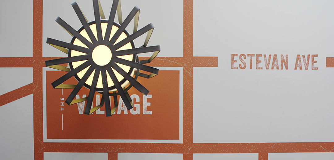
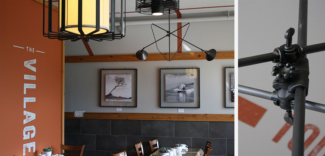
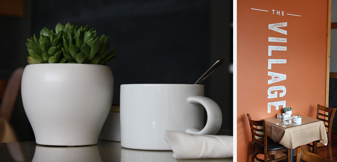
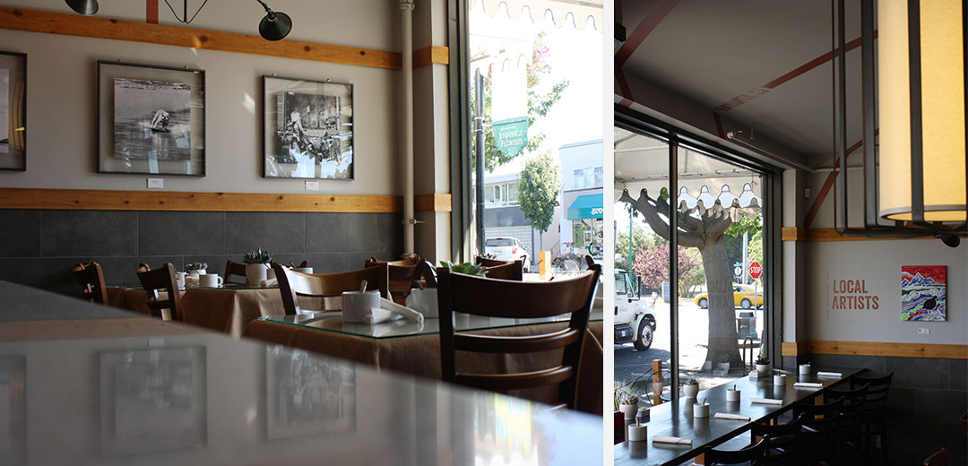
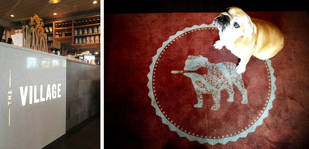
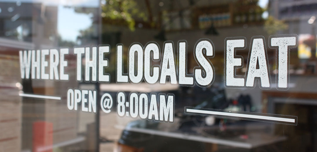
“Meade Design was instrumental in the re-branding and re-design of The Village. Their unique design plan have attracted a new demographic to our Village and brought along a ton of attention from the media. We receive compliments on our restaurant daily and several of our Villagers have put many of our design elements in their own home.

Ivan Meade is a creative genius and compliments it with a practical understanding of how a business operates. More importantly he budgets as if it were his own business and maximizes value in all of his design aspects.

We found the Meade Design to be accessible, professional, efficient, friendly and genuinely a pleasure to deal with. We can’t say enough about Echo, Jeff and Sabrina. There are no individuals at Meade, they work together seamlessly as a team and it shows every time we have contact with them.

We are proud to say Meade Design is a part of our Village family and we include them in all of our plans moving forward. We don’t move on anything: branding, website, social media or design without their consultation first.

There is no doubt that Meade Design has raised the bar, their continued success is proof and they come with our highest recommendation.”

Jason Chan

Graphic Design Client, Owner

want what they've got?

Luly Lash

Luly Lash

Luly Lash is s salon dedicated exclusively to eyelash extensions. To keep the feel of their products, the logo was kept simple, delicate and natural. A custom font was created with a detail at the end of the text mimicking a full set of lashes. Throughout the print goods and website, their mantra ‘Wake up Pretty’ was applied alongside pin-up style models and a floral detail for a feminine and fun appeal.

want what they've got?