Oak Bay Optometry

Oak Bay Optometry

Oak Bay Optometry wanted a logo that would convey their profession without being obvious, as well as being clean and contemporary like their Oak Bay practice interior. An abstracted eye was created using interlocking concentric circles and paired with a round but clean font. Using the Pantone Colour of the Year, Radiant Orchid, the logo was given an on-trend injection of personality.

want what they've got?

Nest and Cradle

Nest & Cradle

Nest & Cradle is a retail store on Yates Street, right here in Victoria BC. With the enticing tagline, “Because life is lovely”, the shop is sweetly feminine and appealing to the lifestyle of the modern woman, children, and those who love them. Nest & Cradle was in need of a brand that would portray them as all that they are: hip, friendly, fun and of course, lovely!

Curvaceous typography was looped to form a nest or cradle-like shape was used as the main focus of the design. Punchy acidic greens and bright peacock blues were used throughout the printed goods and website to add interest and trends that could be easily changed.

want what they've got?

Mille FIori

Mille Fiori Spa

New spa owner, Christine Boutillier, wanted a look that was more bold and contemporary than what one would expect from a spa; one that would depict her as being a young, fresh and unique alternative to her competitors, but with a reference to the classic, Italian inspiration behind the company name and location.

A loosely sketched flower was paired with an elegant typography on a dark background to create the final design. The contrast provided by the black and white linen duplex paper and the soft lines of the flower being foiled in a chrome-like metallic amps up the edginess of this package.

want what they've got?

Meg de Candia

Meg De Candia

Quite possibly Meade Design Group’s most fashion forward logo yet, international handbag designer Meg De Candia asked for help to re-brand herself with a new logo, business cards, and an invitation/brochure design. The goal was to create a look that would hold it’s own against heavy-weight brands such as Calvin Klein, Michael Kors, Balenciaga and Kate Spade. This clean but edgy logo with strong diagonal lines, juxtaposed directions and stacked typography accomplishes just that. The logo also lent itself to a stunning use of repetition with her images and a beautiful custom pattern that was used inside the business cards and layered onto the image at the back of the brochure with a detail shot of the gorgeous hides she uses in her designs.

want what they've got?

Lori Dundas

Lori Dundas

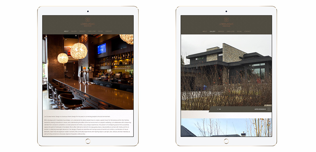
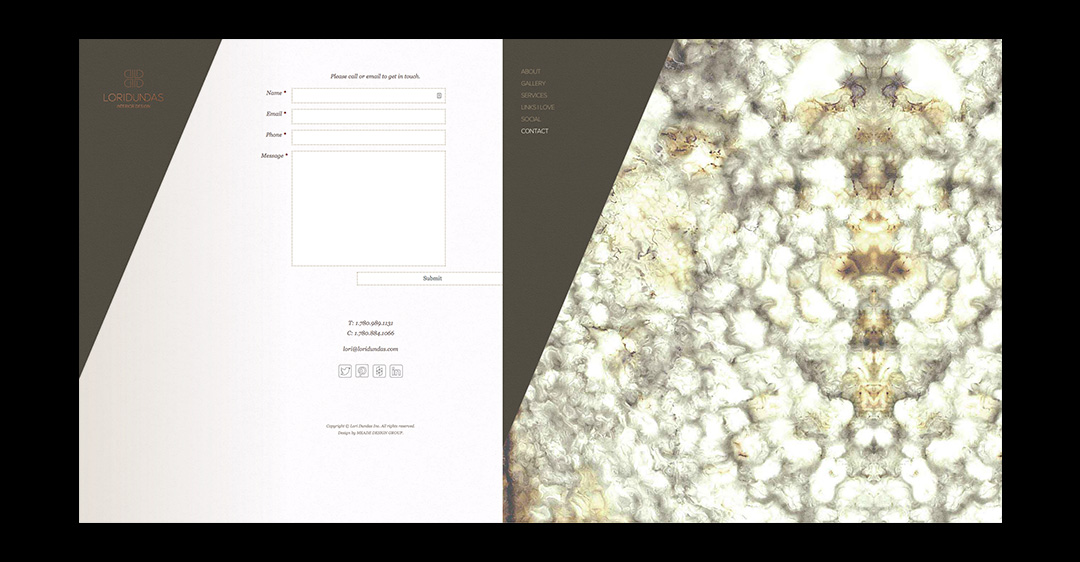
Edmonton-based interior designer, Lori Dundas approached Meade Design Group to re-brand her firm to target sophisticated, open-minded clientele. A gorgeous package was developed that is both complete and cohesive; from business cards, stationery, thank you cards, presentation folders, a website and everything in between, Lori’s package is a stunning collection.

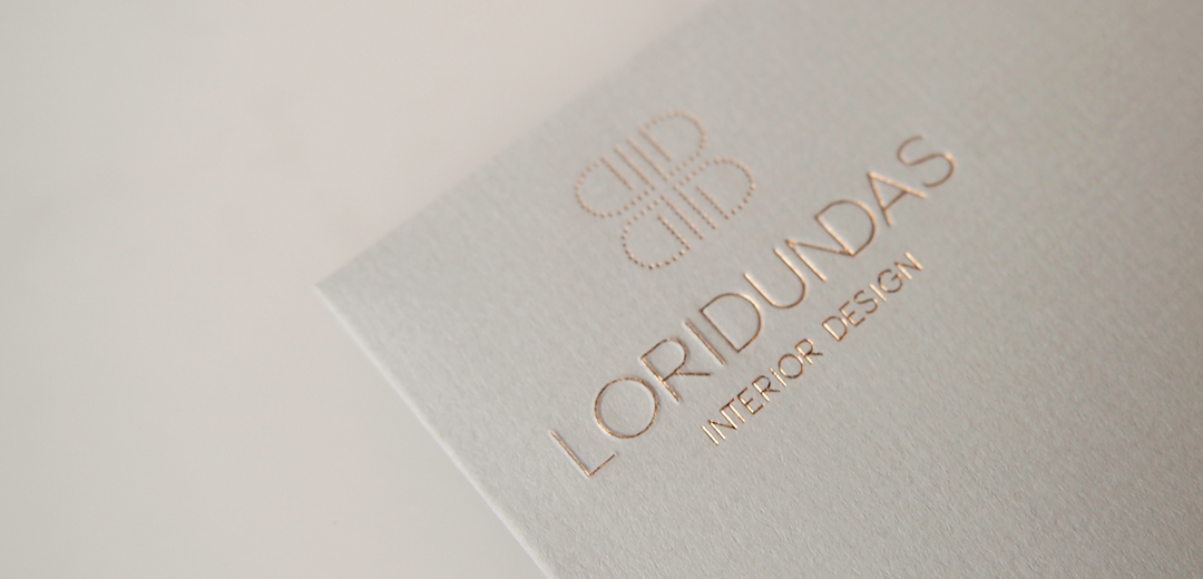
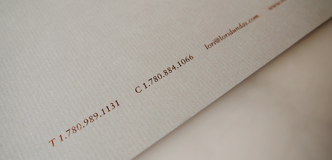
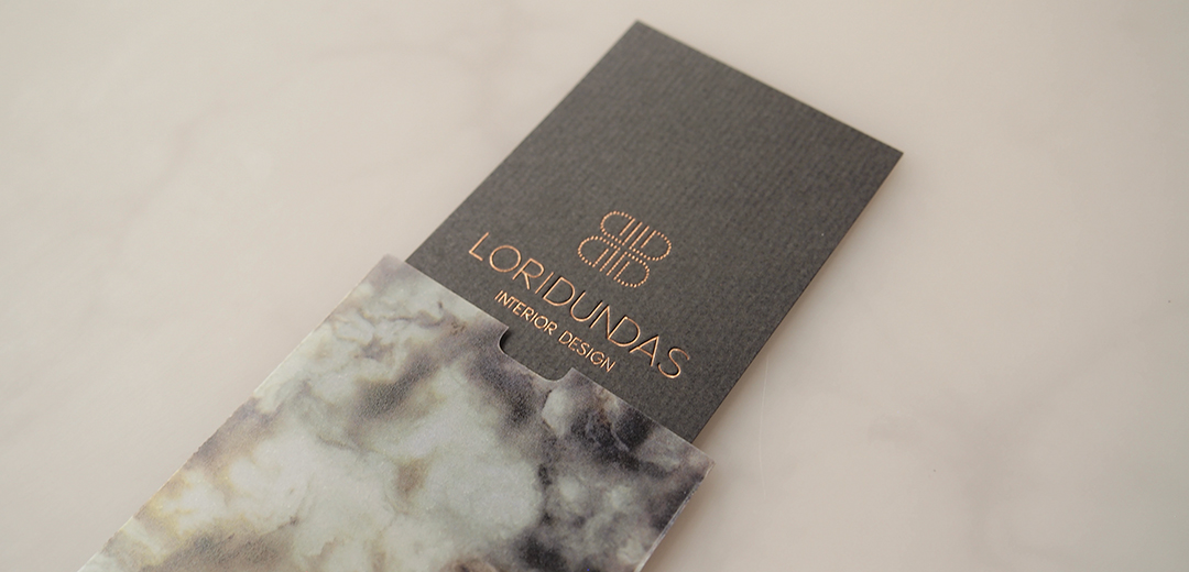
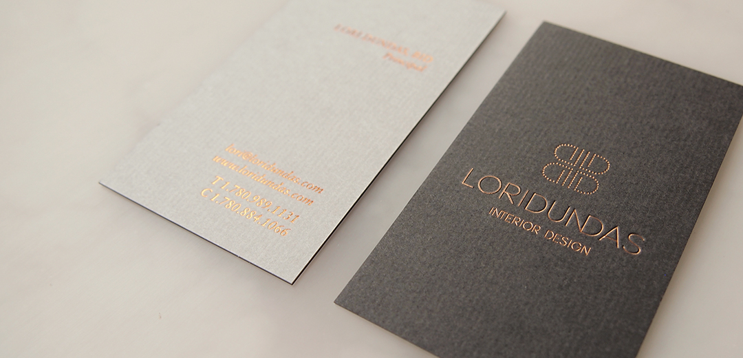
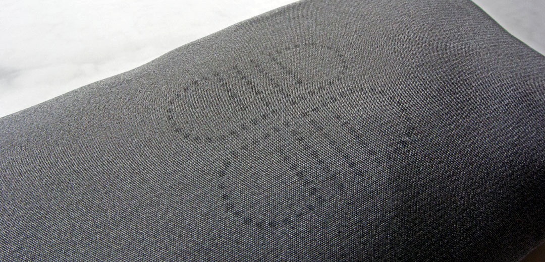
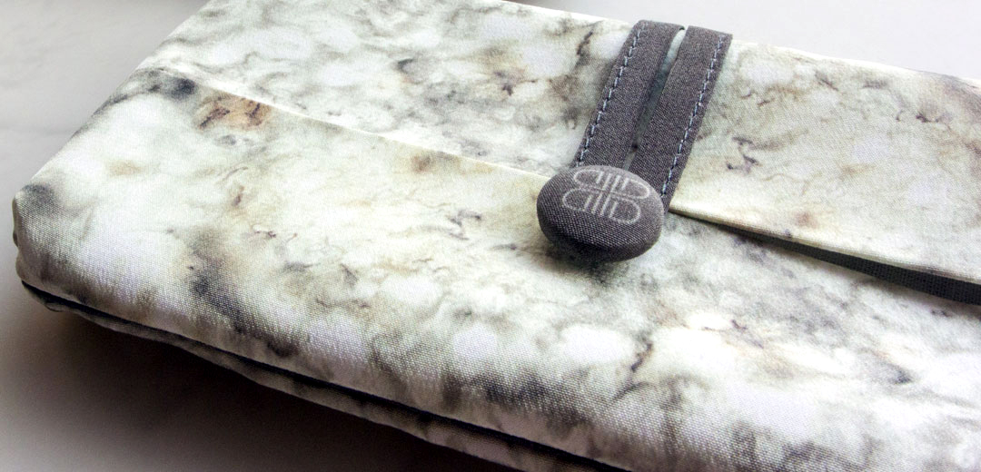
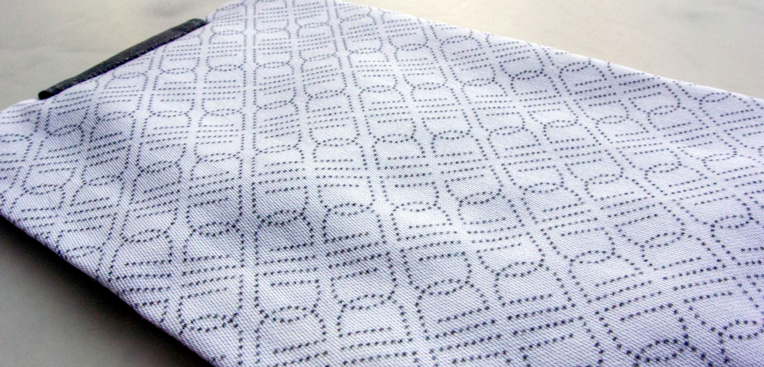
The logo was created with simple typography and a pointillism-style monogram which utilized the “L” and “D” in a continuous stroke which was duplicated and rotated for balance and a beautifully repeatable pattern.  For the print materials and website, a magnificent stone image was used  as the launching point. A rich, warm grey was pulled from the image for the paper stock and duplexed with cream in a textured finish. The logo itself was embossed and debossed for emphasis, then foiled for subtle glamour.

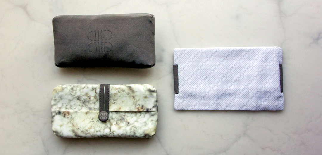
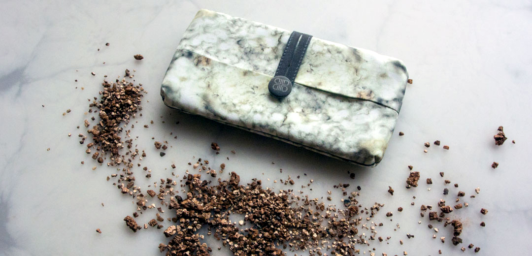
For the holiday season, we expanded Lori’s brand by creating a line of silk sachets. These beautiful, bespoke items were constructed with custom printed silk and buttons, and finished with a delightful bergamot and coriander fragrance.

want what they've got?