Don Felix

Don Felix

A limited edition brand of mezcal from Mexico, Don Felix needed branding that showed how exclusive and exquisite their product was. A blend of classic and contemporary typography was mixed alongside a pointillistic portrait of the man the limited edition run was named after. The branding was done in a crisp black and white approach for timeless appeal.

want what they've got?

Barbara Gergel

Barbara Gergel

Barbara Gergel is a very talented and recognized local stylist. From residential to landscape design, Barbara’s ability to mix styles, deep knowledge of the design elements and a clear understanding of her clients needs are evident in each of her projects. Barbara’s designs have always been characterized by the elegance of their lines and a sense of uniqueness. Her work is often transitional with a perfect blend of classic and contemporary elements.

Meade Design Group created a design which exudes class, flair and elegance with the use of a swooping peacock feather, clean typography, metallic inks and a chartreuse colour palette which has been used on business cards and a one-page website.

want what they've got?

Seventy Seventy

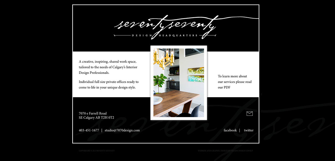
Seventy Seventy Design Headquarters

7070 Design Headquarters is a new studio that has just launched in Calgary, Alberta. It is a place designers can go to use the resource library, hold meetings, and even rent out office space. A shared work space for Calgary’s design community.

Meade Design Group was approached by the owner, Leanne Bunnell, for graphic design services. She was looking for something classic and sophisticated – yet adaptable, allowing designers with their own identities to fit right in. A typographical solution was created that has an understated detail completing the seemingly handwritten font – the final line entices your eye to follow it throughout the e-brochure, business card and website. The elegantly versatile aesthetic was carried through with a colour scheme of black, white and gold.

want what they've got?

404 Cartwright

404 Cartwright

Repeat client, Valentino Homes was in need of branding for their most recent development, the 404 Cartwright. Drawing inspiration from the golf course location and classic-modern architecture, Meade Design Group created a logo that was exactly what the client was looking for. The branding was applied in a silvery-taupe on white throughout business cards, presentation folders and even customized tear sheets outlining the floor plans and features.

want what they've got?

Beth Krupa

Beth Krupa

Home stylist and Realtor, Beth Krupa was in need of a versatile logo that portrayed her pleasant demeanour and stylish flair. Her name was branded in a way that can have different tag-lines beneath it in a scripted font. A whimsical floral mark was added for a burst of colour and casual approachability.

Client Testimonial

“I’ve enjoyed working with Ivan in the past and have been very pleased with his creativity and understanding of my needs. He has a very personable and professional manner.”

Beth Krupa

Graphic Design Client, Stylist, Realtor

want what they've got?