My Design Agent

My Design Agent

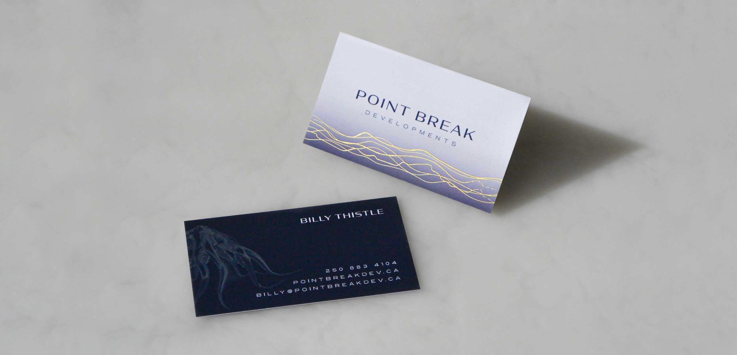
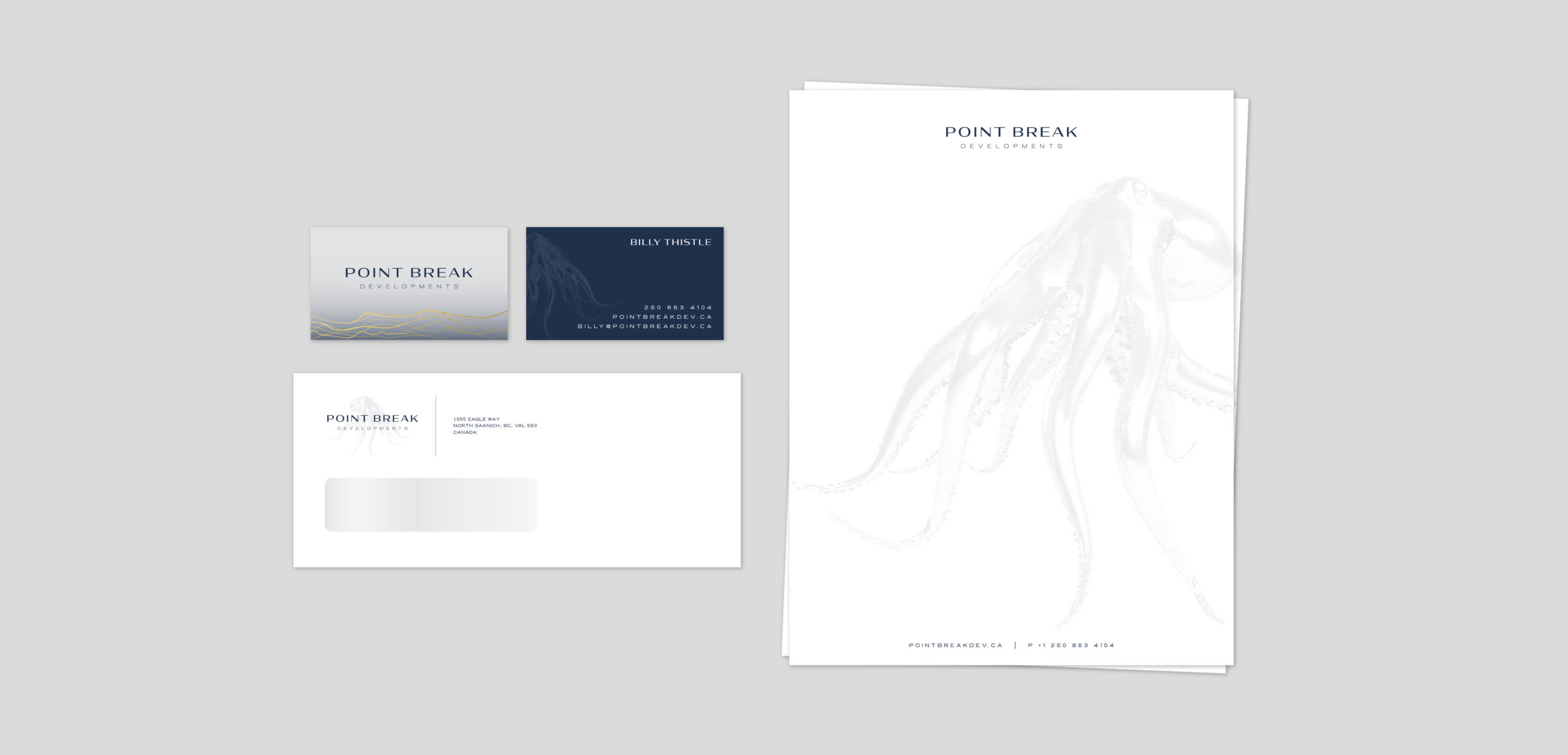
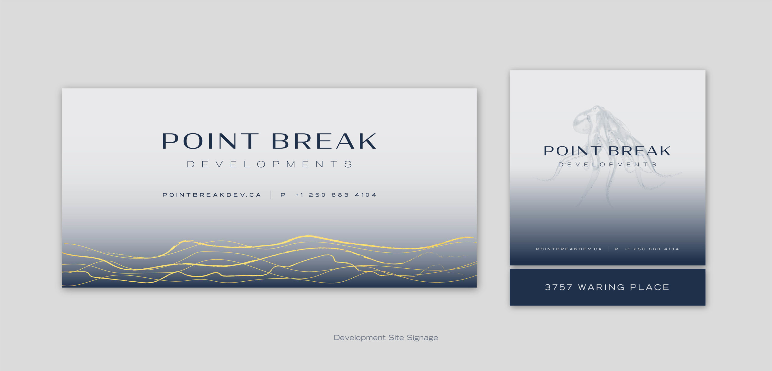
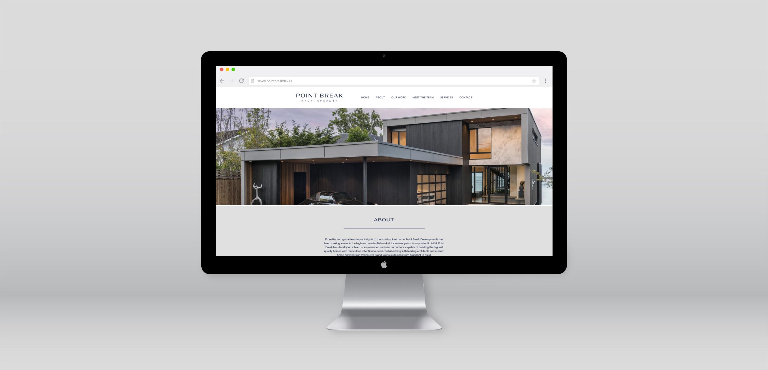
Meade Design Group has the pleasure of creating the logo and brand identity for a talented interior designer, and former MDG member, as she begins her own interior design consultancy – My Design Agent. Both the logo, an elegant serif typeface framed within an arch, and the logo mark, a monogram enclosed within a circle, are both interchangeable and work together cohesively. This timeless logo was brought to life using a rich navy blue paired with muted neutral tones, polished off with beautiful rose gold foiling to add warmth and sophistication to the brand.

Meade Design Group had the pleasure of providing the client with a logo, branding elements and specialty die-cut business cards.

want what they've got?

Royal Roads University

Royal Road University

Royal Roads University reached out to Meade Design Group to redesign 143 dormitory rooms and 33 ensuite-style rooms on the historical campus. Meade Design Group created a clean and sophisticated design concept incorporating subtle textures and patterns, 3D elements, and a calm gender-neutral colour scheme.

This project included drafting floor plans, material selections, conceptual furniture plans, customized graphics including door signage, branded accent pillows, and a wall mural of the original Hatley Castle floor plans. Digital renderings were created to bring the rooms to life and provide a much needed refresh.


Concept Renderings by Meade Design Group

want what they've got?

McClure Street

McClure Street

Combining traditional and contemporary features to create a truly unique and elevated bachelor pad that exudes confidence. The goal for this home was to maintain the building’s character by restoring crown moldings and heritage features, while adding contemporary furnishings and a bold palette to infuse a strong and sophisticated European vibe. Moody, metallic wallpapers, intriguing sculptural lighting and brass features throughout the home create a ‘wow’ moment within each room.

Iván Meade and his team delivered a bold and edgy transformation to this Victoria heritage home.


Photographs by Jeffrey Bosdet for Spruce Magazine

want what they've got?

Point Break Developments

Point Break Developments

Point Break is a Vancouver Island based development company that specializes in high-end residential projects. Point Break Developments approached Meade Design Group for a brand identity refresh. Our goal was to create a brand that is both West Coast inspired, yet sophisticated and elevated.

Using the surrounding Pacific ocean as inspiration for their name, the brand palette and graphic elements reflect and pay homage to the deep blue sea. The typographical solution consists of a clean and refined sans-serif typeface that is supported by the gold foiled waves or, interchangeably, the octopus insignia.

Meade Design Group had the pleasure of providing Point Break Developments with a full brand identity, specialty foiled business cards, large-scale site signage, branded stationery, apparel and a custom website.

Maximus Logo
Business Card for Maximus

want what they've got?

FARM – Duncan

Farm – Duncan

In our fourth experience working with the FARM family of dispensaries, Meade Design Group continued the concept of combining the aesthetic of the previous projects in a new, unique interpretation fitting for each neighbourhood. For the new, Duncan location, Meade Design Group took a cleaner, more contemporary approach for the interior finishes and exterior design, while maintaining the familiar and welcoming ambiance.

Returning clients will recognize the large-scale mural, millwork, wall coverings, lighting and displays from the previous locations. Whereas old and new clients alike will enjoy new features such as tiled floors and warm tones on the walls. As seen in all previous locations, the branding has been applied to the flooring, windows, and tiled walls; for a cohesive, yet individual approach for their latest retail store.


Concept Renderings by Meade Design Group

want what they've got?