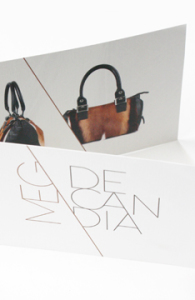
 This is quite possibly our most fashion forward logo yet.
We were thrilled when international handbag designer Meg De Candia asked Meade Design Group to help her re-brand herself with a new logo, business cards, and an invitation/brochure design.
We wanted to create a look that would hold it’s own against heavy-weight brands such as Calvin Klein, Michael Kors, Balenciaga and Kate Spade. Not to toot our own horn, but we think we did with this clean but edgy logo with stong diagonal lines, juxtaposed directions and stacked typography. The logo also lent itself to a stunning use of repetition with her images and a beautiful custom pattern that was used inside the business cards and layered onto the image at the back of the brochure with a detail shot of the gorgeous hides she uses in her designs.
Please visit the identity and print galleries to see the complete project.
Sep 30, 2011 | Project Updates
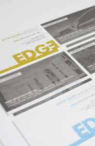 We cannot wait to share our most recent stationery and website package with you – Edge Architecture.
Founder of Edge Architecture Gaston Castaño [Maibc] came to Meade Design Group for an identity that would appeal to his design-conscious clientele. His company mantra? “The name EDGE recognizes the firm’s goal to provide a competitive edge to design practices that want to add value to their project deliverables”.
We went for it, with a bold lettering style and bleed that is most certainly eye-catching. The stationery was printed in four colours to maximize the punchiness of the Edge brand, and even features a die-cut to enhance the unique feature of the offset lettering within the logo. For more details go here.
To learn more about Gaston Castaño and his firm, please check out his website at: http://edge-arch.com/
Sep 22, 2011 | Project Updates
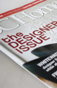 White is classic, yet strikingly modern. How can you achieve that beautiful, gallery inspired space with crisp white walls without looking stark or sterile?
BC Home to the rescue!
Our principal, Ivan Meade, has been interviewed for the latest issue of BC Home’s article “Fresh Whites” (page 109) alongside very talented fellow designers Patricia Gray and Valerie Edwards. You are sure to find the answers to any of your white questions within the pages of this story.
As always, we were very pleased to have our input featured in this great magazine. The text by Catherine Tse was a pleasure to read and the layout and photography is stunning as always.
For photographs of projects where we have used white in our designs, check out our Interior Design portfolio and take a look at Spring Bay and Persimmon Drive in particular.
Sep 8, 2011 | Studio News
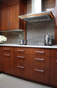 We are thrilled to present the completed kitchen from our Persimmon Drive project. The image to your left is just a teaser – in fact, we have just uploaded a whole new gallery for this project in our Interior Design Portfolio for your viewing pleasure.
As you will read about in the gallery, this project was completed over several years – room by room – until this couple (some of our favourite repeat clients) had their finished dream home.
The timeless lines and warm yet contemporary colour palette was introduced throughout the entire home with sleek, walnut millwork and sparkling polished chrome fixtures to create a contemporary but homey ambiance. We didn’t want the tone-on-tone palette to read as dull, so interest was created with custom tile patterns, eye-catching wallpapers and fabrics featuring subtle changes in texture. Please visit the gallery to see the complete project.
Aug 18, 2011 | Project Updates
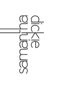 We are very pleased with the outcome of this recently completed graphic and web-design project for local artist, Samantha Dickie.
Sam is a very talented sculptor and wanted a look that was sleek and simple, so as not to distract from her beautiful artwork. She also wanted something that would be appealing to the the art and design community, so it had to be oozing with style. Ultimately, we came up with this clean, typographical solution with elongated lettering and a unique, mirrored effect. The logo worked very well in all applications, and we were pleased to help her create a new website, pottery seal and business cards to get her noticed.
To learn more about Sam Dickie and her work, please check out her website at: http://www.samanthadickie.com/
Jul 26, 2011 | Project Updates
 This is quite possibly our most fashion forward logo yet.
 We cannot wait to share our most recent stationery and website package with you – Edge Architecture.
 White is classic, yet strikingly modern. How can you achieve that beautiful, gallery inspired space with crisp white walls without looking stark or sterile?
 We are thrilled to present the completed kitchen from our Persimmon Drive project. The image to your left is just a teaser – in fact, we have just uploaded a whole new gallery for this project in our Interior Design Portfolio for your viewing pleasure.
 We are very pleased with the outcome of this recently completed graphic and web-design project for local artist, Samantha Dickie.