 Some of our favourite clients, the owners of the Village, asked us to help them create a secondary logo for their branding. They wanted something with no text that really spoke to the personality of the restaurant.
We opted to maintain the distressed look of the primary logo and map designs, as well as the vibrant burnt orange to keep a strong connection. A popular framed photograph of the owner’s bulldog in the restaurant quickly became a source of inspiration. But how do we make the leap from bulldog to breakfast you ask? Well obviously, the dog is hungry for their delicious benny’s too – and with the addition of a spoon in the dog’s mouth and bold patterns to create focus, a secondary logo was born.
You will see this graphic used more prominently in the new Village we are working on in Royal Oak, and the Village team already loves it so much that they are using it in all new graphics and their social media!
Check out the restaurant interior design project and what did for their branding and graphics design.
Mar 26, 2013 | Project Updates
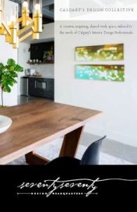 7070 Design Headquarters is a new studio that has just launched in Calgary, Alberta. It is a place designers can go to use the resource library, hold meetings, and even rent out office space. A shared work space for Calgary’s design community.
We were approached for our graphic design services by seventyseventy who were looking for something classic and sophisticated – yet adaptable, allowing designers with their own identities to fit right in. We went with a typographical solution that has an understated detail with the seemingly handwritten font – the final line entices your eye to follow it throughout the e-brochure, business card and website. The elegantly versatile aesthetic was carried through with an colour scheme of black, white and gold.
We just launched the seventyseventy website, check it out today at http://7070.ca to see what 7070 has to offer.
Jan 25, 2013 | Project Updates
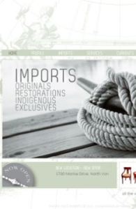 We were thrilled to work with Michelle Annette Kelava-Juszczyk on her unique business, Pacific Post Imports. A pop-up shop which brings in one-of-a-kind finds from all over the world, curated by Michelle herself who has been in the design industry for over 20 years. We’ll be adding Pacific Post’s print work soon, but in the meantime you can satiate your curiosity by checking out the website for yourself at: www.pacificpostimports.com!
In the end, we think the project as a whole reflects Pacific Post beautifully. A serene West-Coast inspired colour palette with an abundance of nautical references to help visitors imagine the travels these pieces have been on. From a technical perspective, this site works great for the business as well. It is CMS, meaning Michelle is able to update and manage the site herself with ease – very important in a business like hers since inventory can change daily.
Check out Pacific Post today, we can’t wait to see where they pop up next!
Nov 13, 2012 | Project Updates
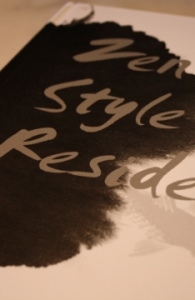 Meade Design Group’s interiors shall live on forever in hard cover form!!! We just got the book entitled Zen Style Residences where our interior design project “Marifield” appears within their glossy pages.
For this project, we wanted to achieve a look that was effortless yet sleek, refined, warm and comfortable. We combined rich tones of sepia, burnt orange and charcoal in a range of textures and patterns to form a warmly layered, lived-in-ambiance. The custom designed fireplace emphasizes the height and creates an interesting focal point, counter-balanced by the commissioned art piece hung above the sofa.
It is so cool to see our designs published in a book with information written in two languages – and it’s a beautiful book at that! To see more of this project, check out the article on our media page!
Aug 23, 2012 | Project Updates, Studio News
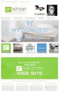 How cool is it that we were able to help one of our favourite stores re-brand themselves? We were thrilled to get the call from Ross Taylor, owner of Gabriel Ross, to help him create a new image/site for his online store, now known as GR Shop. Check out the website for yourself at: http://grshop.com/!
One of the most important factors in this project was maintaining a recognizeable connection to the old image, since Gabriel Ross has a large client base spread across the country. The other key element was the navigation. There is a lot of information on this site on a lot of different product types, so it was important to maintain consistency in how to access and display this information, as well as explore the entire site with ease – there’s more than just products for sale here, there’s a blog, and the ability to create wish lists and gift registries. With all that in mind, we also had to consider that this was also an e-commerce and content management site – which made the programming far more in depth.
Aug 16, 2012 | Project Updates
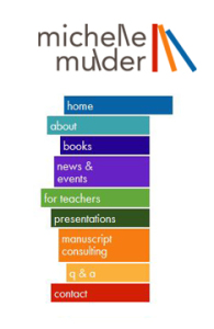 We were so happy to get the call from a dear friend of Meade Design Group, Mrs. Michelle Mulder, when she wanted a new look for her website.
We knew Michelle’s image would have to be fun and kid friendly (she is a children’s author), but maintain a professional look for the teachers and parents that would be using her website for resource materials, or for the professional clients who hire Michelle for manuscript consulting and copy writing.
We created a playful, abstracted version of a bookshelf in primary colours inspired by the series of vertical lettering in her name and continued the concept for the website’s menu.
We’ve posted her logo in our web and identity portfolios, but definitely check her website out for yourself at: http://www.michellemulder.com/
Jun 20, 2012 | Project Updates
 Some of our favourite clients, the owners of the Village, asked us to help them create a secondary logo for their branding. They wanted something with no text that really spoke to the personality of the restaurant.
 7070 Design Headquarters is a new studio that has just launched in Calgary, Alberta. It is a place designers can go to use the resource library, hold meetings, and even rent out office space. A shared work space for Calgary’s design community.
 We were thrilled to work with Michelle Annette Kelava-Juszczyk on her unique business, Pacific Post Imports. A pop-up shop which brings in one-of-a-kind finds from all over the world, curated by Michelle herself who has been in the design industry for over 20 years. We’ll be adding Pacific Post’s print work soon, but in the meantime you can satiate your curiosity by checking out the website for yourself at:
  Meade Design Group’s interiors shall live on forever in hard cover form!!! We just got the book entitled Zen Style Residences where our interior design project “Marifield” appears within their glossy pages.
 How cool is it that we were able to help one of our favourite stores re-brand themselves? We were thrilled to get the call from Ross Taylor, owner of Gabriel Ross, to help him create a new image/site for his online store, now known as GR Shop. Check out the website for yourself at:
  We were so happy to get the call from a dear friend of Meade Design Group, Mrs. Michelle Mulder, when she wanted a new look for her website.