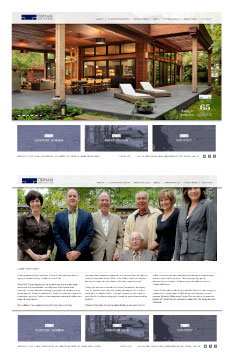
 Take a peek at Tidman Construction’s new online look at: www.tidmangroup.com courtesy of Meade Design Group!
65 years young and third generation family business, Tidman Construction was in need of an updated website. We made use of a CMS via WordPress which makes real-time updates super easy for their staff. With these great new features, we have also made the website responsive, meaning that it looks just as great on smart phones, tablets and small screens as it does on larger screens.
Tidman construction wanted something that would reflect the timeless quality of their work. The design is clean yet classic and very easy to navigate with subtle branding throughout.
Feb 13, 2015 | Project Updates
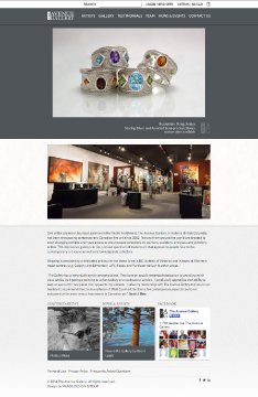 Take a peek at The Avenue Gallery’s new look at: theavenuegallery.com courtesy of Meade Design Group!
We updated one of Victoria BC’s best art galleries with a new site which makes updating (thanks to CMS via WordPress) and online purchasing (e-commerce) a breeze. With these great new features, we have also made the website responsive, meaning that it looks just as great on smart phones, tablets and small screens as it does on larger screens.
The new look is subtle and clean. The greyscale palette allows all of the artwork to pop while maintaining an unobtrusive and contemporary aesthetic.
We are excited to enable The Avenue Gallery to extend their reach beyond Oak Bay Avenue to the rest of BC, Canada, and indeed the world wide web.
Jul 5, 2014 | Project Updates
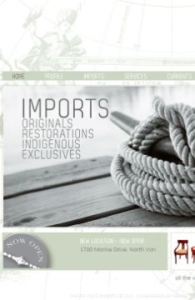 We were thrilled to work with Michelle Annette Kelava-Juszczyk on her unique business, Pacific Post Imports. A pop-up shop which brings in one-of-a-kind finds from all over the world, curated by Michelle herself who has been in the design industry for over 20 years. We’ll be adding Pacific Post’s print work soon, but in the meantime you can satiate your curiosity by checking out the website for yourself at: www.pacificpostimports.com!
In the end, we think the project as a whole reflects Pacific Post beautifully. A serene West-Coast inspired colour palette with an abundance of nautical references to help visitors imagine the travels these pieces have been on. From a technical perspective, this site works great for the business as well. It is CMS, meaning Michelle is able to update and manage the site herself with ease – very important in a business like hers since inventory can change daily.
Check out Pacific Post today, we can’t wait to see where they pop up next!
Nov 13, 2012 | Project Updates
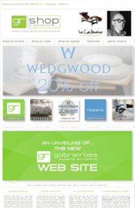 How cool is it that we were able to help one of our favourite stores re-brand themselves? We were thrilled to get the call from Ross Taylor, owner of Gabriel Ross, to help him create a new image/site for his online store, now known as GR Shop. Check out the website for yourself at: http://grshop.com/!
One of the most important factors in this project was maintaining a recognizeable connection to the old image, since Gabriel Ross has a large client base spread across the country. The other key element was the navigation. There is a lot of information on this site on a lot of different product types, so it was important to maintain consistency in how to access and display this information, as well as explore the entire site with ease – there’s more than just products for sale here, there’s a blog, and the ability to create wish lists and gift registries. With all that in mind, we also had to consider that this was also an e-commerce and content management site – which made the programming far more in depth.
Aug 16, 2012 | Project Updates
 Take a peek at Tidman Construction’s new online look at: www.tidmangroup.com courtesy of Meade Design Group!
 Take a peek at The Avenue Gallery’s new look at:
  We were thrilled to work with Michelle Annette Kelava-Juszczyk on her unique business, Pacific Post Imports. A pop-up shop which brings in one-of-a-kind finds from all over the world, curated by Michelle herself who has been in the design industry for over 20 years. We’ll be adding Pacific Post’s print work soon, but in the meantime you can satiate your curiosity by checking out the website for yourself at:
  How cool is it that we were able to help one of our favourite stores re-brand themselves? We were thrilled to get the call from Ross Taylor, owner of Gabriel Ross, to help him create a new image/site for his online store, now known as GR Shop. Check out the website for yourself at: