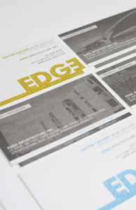
 We cannot wait to share our most recent stationery and website package with you – Edge Architecture.
Founder of Edge Architecture Gaston Castaño [Maibc] came to Meade Design Group for an identity that would appeal to his design-conscious clientele. His company mantra? “The name EDGE recognizes the firm’s goal to provide a competitive edge to design practices that want to add value to their project deliverables”.
We went for it, with a bold lettering style and bleed that is most certainly eye-catching. The stationery was printed in four colours to maximize the punchiness of the Edge brand, and even features a die-cut to enhance the unique feature of the offset lettering within the logo. For more details go here.
To learn more about Gaston Castaño and his firm, please check out his website at: http://edge-arch.com/
Sep 22, 2011 | Project Updates
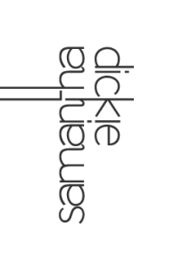 We are very pleased with the outcome of this recently completed graphic and web-design project for local artist, Samantha Dickie.
Sam is a very talented sculptor and wanted a look that was sleek and simple, so as not to distract from her beautiful artwork. She also wanted something that would be appealing to the the art and design community, so it had to be oozing with style. Ultimately, we came up with this clean, typographical solution with elongated lettering and a unique, mirrored effect. The logo worked very well in all applications, and we were pleased to help her create a new website, pottery seal and business cards to get her noticed.
To learn more about Sam Dickie and her work, please check out her website at: http://www.samanthadickie.com/
Jul 26, 2011 | Project Updates
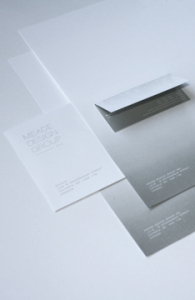 To celebrate the renewal of Meade Design Group we have created a new image for the business, one that embraces our old branding (with the repetition of the horse image and typography of our logo), but also symbolizes our growth and evolution with the use of the gradient and layering of patterns and forms.
We also warmed up our colour palette and softened the lines to better represent our warm and friendly working environment. Now that we have put so much work into our networking and accessibility, we wanted to reflect that in our image; we want to be perceived as professionals who are young, fun, and love what we do – design really is our passion!
Mar 10, 2011 | Studio News