French Kiss Events

French Kiss Events

The owner of French Kiss was looking to update her business image to be more true to herself and her style. As a wedding planner and designer, she was looking for something soft, quirky and romantic. A font was selected that was full of  feminine arabesques which were repeated above and below to encapsulate the logo, they also form beautiful pattern repeats as seen on the business card. These details were all put together atop a delicate undulating form in a rich mulberry colour.
want what they've got?

Atmosphere Design Lounge

Atmosphere Design Lounge

Successful Saskatoon-based interior designer team, Atmosphere Interior Design wanted to branch out and create a storefront where they could sell some of their favourite design products that they felt represented their aesthetic.  One of the principals at Atmosphere was previously a graphic designer, so he had a fairly good idea of what he wanted, and needed not only a great graphic design team to execute a concept, but one that also understood the business of interior design. That is where Meade Design Group came in.

Using a monogram in Atmosphere’s existing branding as the launching point, Meade Design Group layered each letter to emphasize a sense of connection with Atmosphere as well as it’s clients. The “A” and “D” (for Atmosphere Design) were given prominence and the “L”(Lounge) was subtly inset in the “D” and aligned to the horizontal stroke in the “A”, the entire monogram was then outlined for a unique twist on the original branding. The result is refined and recognizable, just like Atmosphere Design’s style.

want what they've got?

Christina Stack

Stack Real Estate

Christina Stack is a local realtor who is tremendous fun and is always herself with her clients – she is not a conventional realtor, but she is very professional and gets great results. She needed a logo that would allow clients to see her as a serious competitor in the real estate market without stripping her of her vibrant and jovial personality.

A navy coloured ground and block lettering provided the serious approach required, whereas the typography for her name and pattern repeats is much more loose and informal. Her name was playfully stacked vertical as a play on words and depiction of her personality. To supplement, Meade Design Group recommended that Christina have photographs depicting her flair for fashion and exceptional rapport with her clients to be used throughout her branding.

want what they've got?

Samantha Dickie

Samantha Dickie

Sam is a very talented sculptor and wanted a look that was sleek and simple, so as not to distract from her beautiful artwork. She also wanted something that would be appealing to the the art and design community, so it had to be oozing with style.

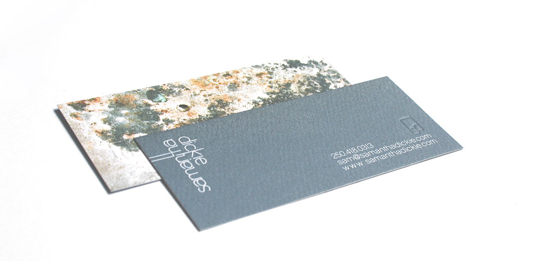
Ultimately, Meade Design Group came up with this clean, typographical solution with elongated lettering and a unique, mirrored effect. The logo worked very well in all applications, and carried through to a pottery seal, stationery, art cards, digital media and business cards.

want what they've got?

Revival

Revival

The Revival Millworks Co. was created to embrace the techniques and salvaged materials of days gone by to create furniture and more. Revival uses only locally sourced components and preserves the story of each element. They needed a logo that reflects both the rich history of the materials and the reinvention of them. A retro-inspired approach was taken using a combination of linear textures, multiple bold fonts and a supporting mark.

want what they've got?