Josee Lalonde

Josee Lalonde

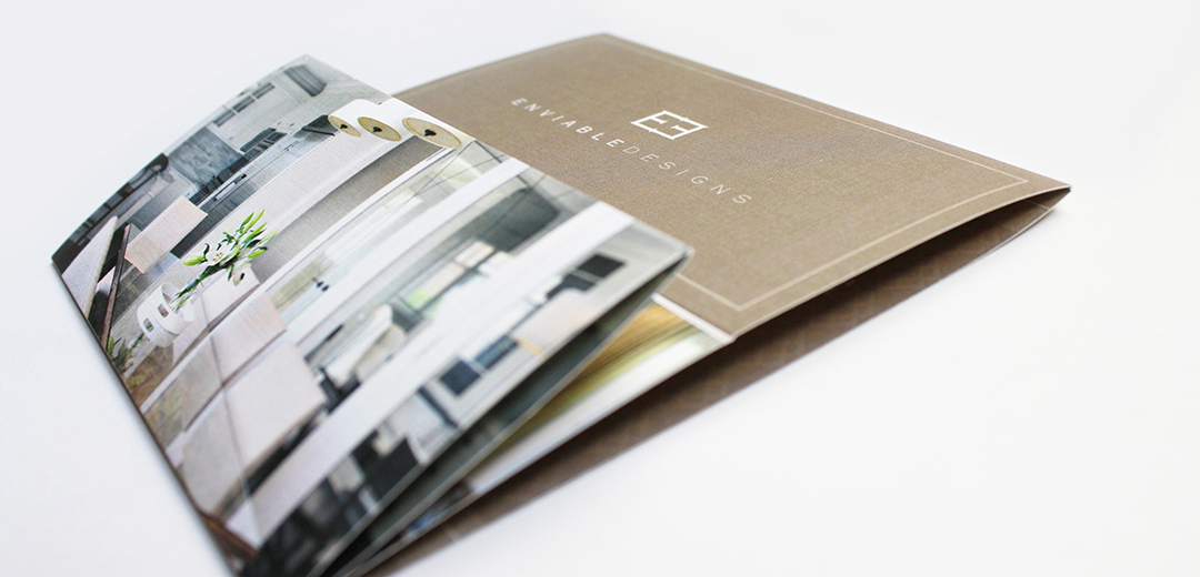
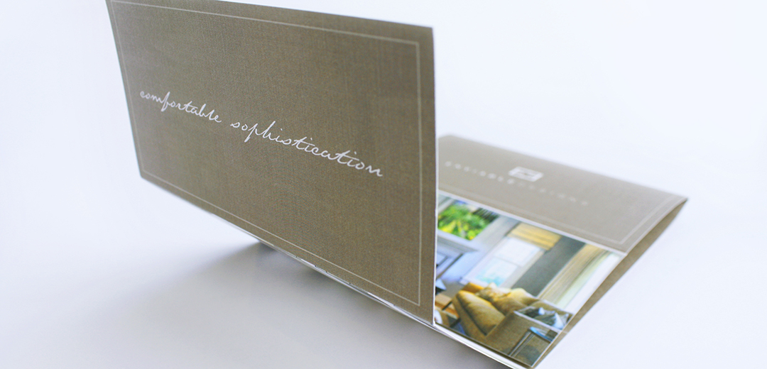
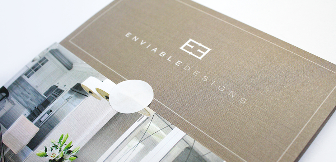
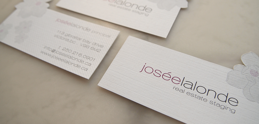
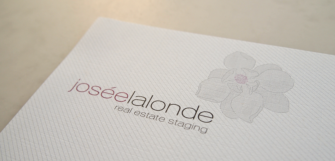
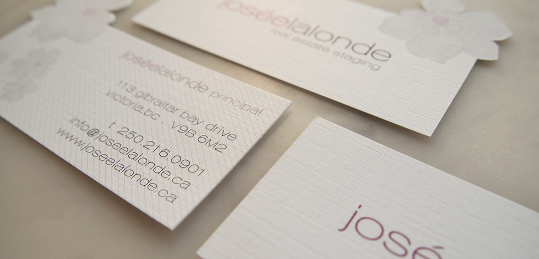
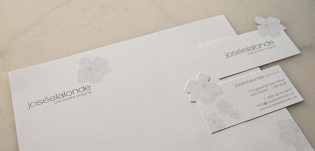
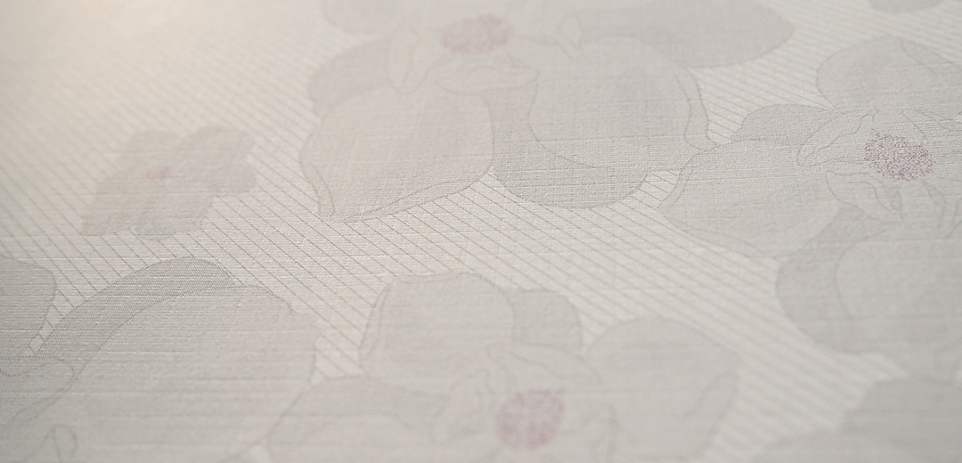
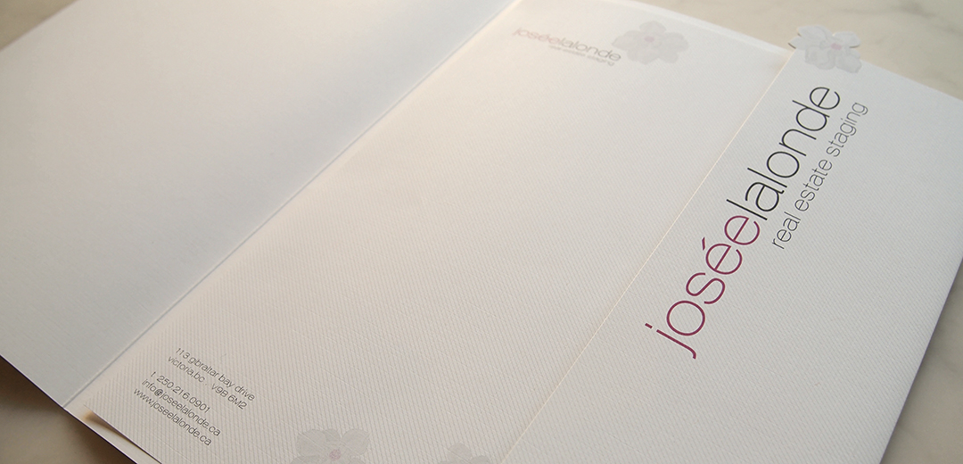
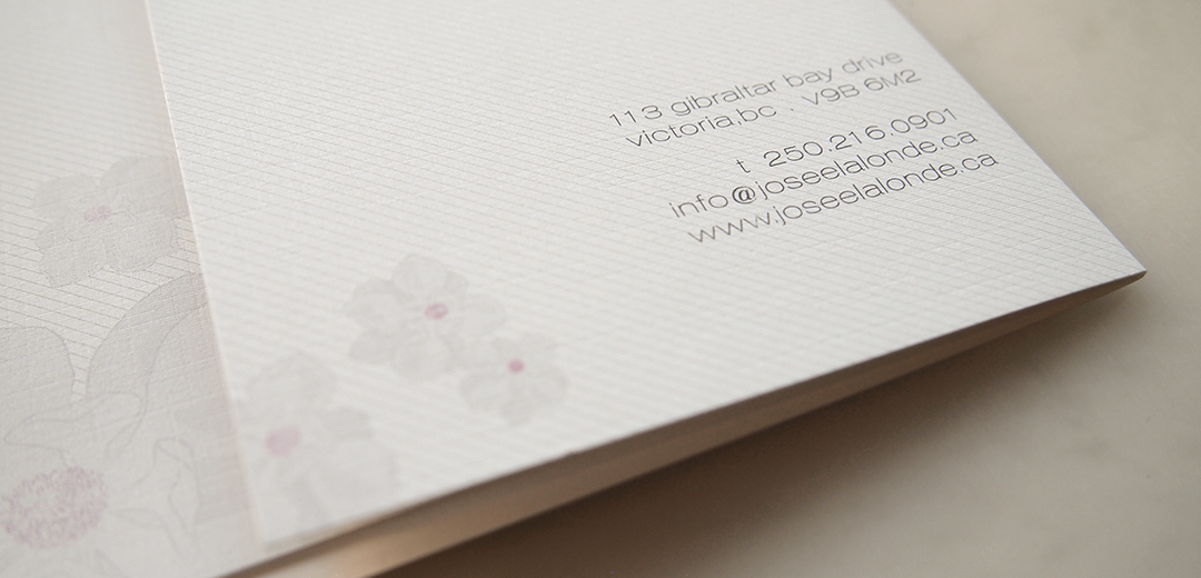
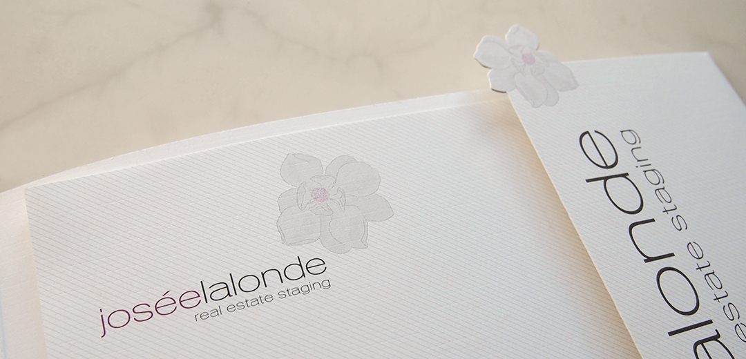
As a relative newcomer to the real estate staging field, Josée needed a graphic identity that would help her stand out from her more established colleagues. Meade Design Group embraced her playful, warm and feminine persona and incorporated her love for the magnolia flower into a beautiful logo paired with a clean typeface.

For a modern twist, an angled pinstripe was applied and cascading magnolias were overlaid throughout the package to achieve the perfect balance of feminine professionalism.

Client Testimonial

“I’ve had the privilege of working with Ivan when I first started my business in 2007. He was tasked to design my branding, which included my website and stationary. With no idea what I wanted, he was able to create an amazing design that represents exactly who I am. He has an aptitude for aesthetics and understanding clients which makes him stand out from the others! He takes pride in what he creates and pays close attention to details. In other words, he doesn’t just create something that looks visually pleasing, but he also makes sure that it reflects the values of your website, product, or organization. I highly recommend Ivan and will continue to work with him indefinitely!”

Josée Lalonde

Graphic and Web Design Client, Principal at Josée Lalonde Design & Owner of The HOUSSE

want what they've got?

Finn & Izzy

Finn & Izzy

New children’s boutique, Finn & Izzy needed a logo for all aspects of all aspects of their retail areas including labels, packaging, stationery, exterior signage and advertising. The client wanted an aesthetic that was fun for the kids, but still representative of the stylish brands they had planned to carry.

The client’s objectives were achieved through the use of bright colours in a bar code pattern which is evocative of a cross-walk, which is found in every school zone. The repeated bars are also symbolic of the multi-cultural appeal that Finn & Izzy tries to achieve through it’s diverse range of products. The result was clean, modern and fun – just like the store itself.

want what they've got?

Exhibit – V

Exhibit-V

Exhibit-V is a blog based on the arts community in Victoria, where creator, Efren Quiroz tours the most recent exhibitions, maintains a calendar of goings-on, interviews artists and reviews works. He needed a stylized yet not overpowering image to brand his venture.

want what they've got?

Enviable Designs

Enviable Designs

Well respected Vancouver-based interior designer, Victoria of Enviable Designs approached Meade Design Group for a complete rebranding package. She wanted an image that would exude her tagline “comfortable sophistication” and read with her interior design aesthetic which has a heavily European influence.

A soft palette of taupes, greys and creams was used to create the relaxed, comfortable tone. the sophistication was developed primarily through the mark which was created with reflected “E”‘s using a traditional font. This mark was also used as a pattern repeat throughout her branding, appearing very classic but also of-the-moment. A combination of linen textures, metallic inks, foils and embossing really enriched the feel of the branding throughout the print package.

Client Testimonial

“We hired Meade Design group to design the business website and overhaul the entire graphic image of Enviable Designs. The whole design team at MDG did an amazing job-not only did they accomplish exactly what we asked but exceeded all of our expectations. I have since hired MDG for several other services such as business card designs and website seo. I would and have recommended anyone to Meade Design Group for all and any graphic design needs.”

Victoria McKenney

Graphic and Web Design Client, Interior Designer

want what they've got?

Edge Architecture

Edge Architecture

After working in the industry for several years, founder of Edge Architecture, Gaston Castaño [MAIBEC] decided to start his own firm and came to Meade Design Group for an identity that would appeal to his design-conscious clientele.

A bold lettering style and eye-catching printed bleed was used throughout the printed package and digital media for an architectural and striking finished product. The stationery was printed in four colours to maximize the punchiness of the Edge brand, and even features a die-cut to enhance the unique feature of the offset lettering within the logo.

Client Testimonial

“I hired Ivan to develop the corporate image of my new firm EDGE Architecture Inc. and was thoroughly impressed with the sharp, comprehensive corporate identity that Meade Design studio developed for my company. I receive compliments on a daily basis about my stationary, business cards and the EDGE website, of course. A very fine job indeed!”

Gaston Castaño

Graphic Design Client, Architect

want what they've got?