Brenda Russell

Brenda Russell

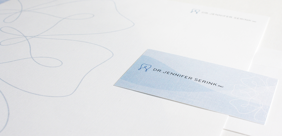
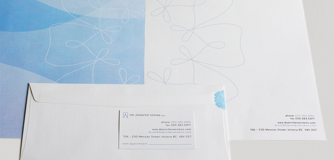
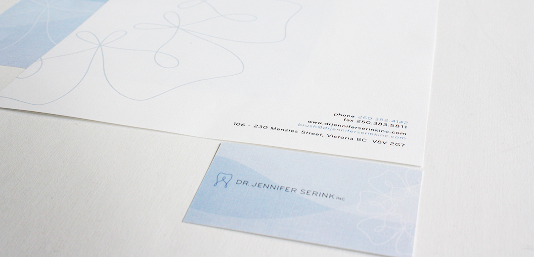
Fashionable, caring, thoughtful, professional and fun are all words that come to mind for repeat client, Brenda Russell. As a top realtor in her field, Brenda needed branding that would portray all aspects of her personality and service offerings. Meade Design Group has handled all of Brenda’s graphic design needs for nearly 10 years, and considers her a dear friend. Her image reads well with not only her personality and professionalism, but also with the Royal LePage agency’s branding. In 2014, Meade Design Group updated her branding with the classic and luxurious combination of black and gold.

Client Testimonial

“Ivan at Meade Design Group is brilliant. His studio consistently produces genius work for me personally and professionally. His graphic, production and interior design ideas never fail to capture a perfect attitude. Whether in a piece of stationary, an interior layout of a home or office, the production design of a presentation or a movie set. Coupled with his artistic and technical abilities he is muy sympatico – an uncanny ability to connect with his clients. He’s the man you want!”

Brenda Russell

Interior and Graphic Design Client, Realtor

want what they've got?

CMC Studios

CMC Studios

CMC Studios is a flooring supplier that deals with trade-only clients. Owner Colleen McCrann needed a look that would appeal to designers and contractors alike, and to stand out from the competition. An acidic green tone was mixed with white, grey and interesting angles to catch the eye of potential clientele. The logo appears strong and confident, but not overly masculine.

want what they've got?

Dr. Jennifer Serink

Dr. Jennifer Serink

Victoria-based dentist, Jennifer Serink was looking for a clean and family-friendly logo. She specifically requested something that would be professional, but entice kids so they would not be afraid of the dentist. The sweeping playful lines of the tooth mark in combination with the simple, curved lines of the typography fit the bill perfectly.

This concept was applied in various blue tones throughout the stationery package and website to present the practice as clean and calm. A circular pattern repeat was also introduced using the mark.

want what they've got?

Interior Design Vancouver Island

Interior Design Vancouver Island

Meade Design Group’s principal, Ivan Meade, created an online community through social media outlets for interior designers and related industries to share events and resources with one another. To appeal to the discerned users, a creative and whimsical logo was created in a bright, friendly, yellow colour.

want what they've got?

JVS Investments

JVS Investments

A new Saskatoon-based investment firm that specializes in residential developments contacted Meade Design Group for a logo that would represent the three founding members. A stylized font was selected to convey personality for the initial of each founding member and was knocked out of a circular form. The circular form represents wholeness and completion, and the symmetrical layout projects balance and stability. The descriptive font was chosen to express trust, experience and professionalism.

want what they've got?