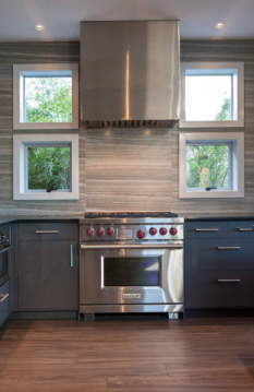
 We are very eager to share this awesome post from MHV (Modern Home Victoria) Magazine featuring our west coast contemporary home redesign. An efficient layout with functional details creates a space that goes far beyond aesthetically pleasing.
We want to thank Jody Beck for capturing this home’s simple west coast design that compliments the beautiful scenery beyond.
Check it out for yourself at: modernhomevictoria.com
We hope you enjoy it as well!
Mar 18, 2016 | Studio News
 For Meade Design Group, the new year brought many new and inspiring projects, people and experiences.
Catch up on all the latest news with Meade Design Group in our most recent MDG Times.
As always, we look forward to your feedback – so feel free to get social with our newsletter!
THE MDG TIMES – NO.11
Mar 18, 2016 | The MDG Times
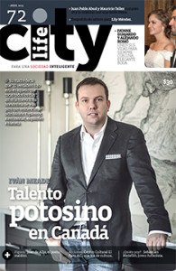 Meade Design Group’s Principal Designer Ivan Meade is on the cover of City Life magazine, the #1 magazine in his hometown of San Luis Potosi, Mexico. Ivan talks about the process of creating his eponymous fabric line “Ivan Meade – A Personal Narrative in Fabrics“, and how each piece was inspired by a different part of his life growing up in San Luis Potosi. For example, the pattern Vista Hermosa was inspired by the pattern on the floor of his grandparents’ home.
You can check out the article by clicking here.
Apr 2, 2015 | Media
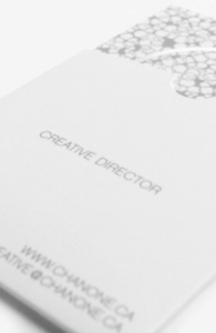 Creative Director Chanone Smith oozes class and sophistication in everything she does. Of course, she needed a fashion forward identity and stationery package to reflect that.
Inspired by fashion institutions, this has to be one of our favourite print jobs yet. The simple yet bold ‘C’ mark with the missing fragment is memorable and elegant. Her wordmark is no different, and places emphasis on the ‘Chanone’ to encourage clients to call her by her first name. An organic, animal print inspired pattern creates visual texture and interest against the main, crisp white background linking the stationery pieces together and adding another level of detail to her package. Custom stickers to seal the envelopes, metallic foils and a velvety laminated finish add tactile impressions to this stunning identity.
Please visit the identity and print galleries of our website to see the complete project.
Feb 22, 2012 | Project Updates
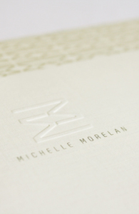 Michelle is a fellow designer that we already knew and loved, so when she approached us to design a new identity for her including logo, stationery, social media and website, we were thrilled.
Embracing Michelle’s personality and aesthetic, we created an identity that was warm, modern and clean – yet natural. Michelle Morelan Design is known for it’s West Coast Contemporary and nature-inspired interiors, as well as stunning renderings. The reflected ‘Double M’ used in her mark has been well received as both a bold, modern statement, and as evoking the natural reflections in the lakes and oceans Michelle experienced throughout her life living on the West Coast. This mark lends itself prefectly to creating gemoetric patterns and coupled with the taupes and charcoals we chose, fits Michelle’s style perfectly.
To learn more about Michelle Morelan Design, please visit the website: here
Jan 13, 2012 | Project Updates
 We are very eager to share this awesome post from MHV (Modern Home Victoria) Magazine featuring our west coast contemporary home redesign. An efficient layout with functional details creates a space that goes far beyond aesthetically pleasing.


 Creative Director Chanone Smith oozes class and sophistication in everything she does. Of course, she needed a fashion forward identity and stationery package to reflect that.
 Michelle is a fellow designer that we already knew and loved, so when she approached us to design a new identity for her including logo, stationery, social media and website, we were thrilled.