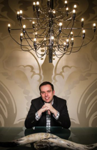
 Vic 42 is a local website that celebrates the unique and interesting people in Victoria – our pricipal, Ivan Meade, was invited to be part of their collection of personalities. He was very honoured to be selected and to share virtual space with some of the most influential people in our own community.
Ivan has always said that Victoria has great talent and that we should embrace it – Now we have an opportunity to discover our locals thanks to VIC 42.
Teresa Lindsay & Al Smith are the geniuses behind the VIC 42 concept. A very innovative and progressive platform to showcase talent.
We highly recommend our followers to check out the site for themselves at: http://www.vic42.com!
Feb 12, 2013 | Studio News
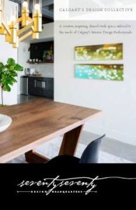 7070 Design Headquarters is a new studio that has just launched in Calgary, Alberta. It is a place designers can go to use the resource library, hold meetings, and even rent out office space. A shared work space for Calgary’s design community.
We were approached for our graphic design services by seventyseventy who were looking for something classic and sophisticated – yet adaptable, allowing designers with their own identities to fit right in. We went with a typographical solution that has an understated detail with the seemingly handwritten font – the final line entices your eye to follow it throughout the e-brochure, business card and website. The elegantly versatile aesthetic was carried through with an colour scheme of black, white and gold.
We just launched the seventyseventy website, check it out today at http://7070.ca to see what 7070 has to offer.
Jan 25, 2013 | Project Updates
 It’s that time again… the latest issue of The MDG Times has arrived!
Please find the link to issue No. 5 of the MDG Times below. Inside you’ll discover the latest goings-on at Meade Design Group. As always, we welcome your feedback so please don’t hesitate to contact us with any questions or comments.
The MDG Times – No.5
Dec 18, 2012 | The MDG Times
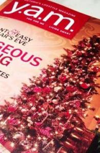 We’ve done it again! Y.A.M Magazine recently consulted Meade Design Group for the latest holiday decorating ideas – and the vertically endowed tree in our studio made the cover!
It was so much fun to have a shoot in our own studio – and who can resist the face on that adorable little French Bulldog, Luba! To prepare for it, we’ve had our tree up for over a month… Echito was very excited to get such a big head start on the holiday celebrations, and we are all now feeling the joy of the season!
This issue is out now, so if you live in Victoria, be sure to pick one up for yourself today!
Nov 16, 2012 | Studio News
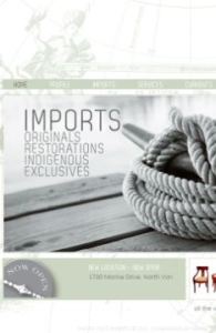 We were thrilled to work with Michelle Annette Kelava-Juszczyk on her unique business, Pacific Post Imports. A pop-up shop which brings in one-of-a-kind finds from all over the world, curated by Michelle herself who has been in the design industry for over 20 years. We’ll be adding Pacific Post’s print work soon, but in the meantime you can satiate your curiosity by checking out the website for yourself at: www.pacificpostimports.com!
In the end, we think the project as a whole reflects Pacific Post beautifully. A serene West-Coast inspired colour palette with an abundance of nautical references to help visitors imagine the travels these pieces have been on. From a technical perspective, this site works great for the business as well. It is CMS, meaning Michelle is able to update and manage the site herself with ease – very important in a business like hers since inventory can change daily.
Check out Pacific Post today, we can’t wait to see where they pop up next!
Nov 13, 2012 | Project Updates
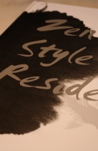 Meade Design Group’s interiors shall live on forever in hard cover form!!! We just got the book entitled Zen Style Residences where our interior design project “Marifield” appears within their glossy pages.
For this project, we wanted to achieve a look that was effortless yet sleek, refined, warm and comfortable. We combined rich tones of sepia, burnt orange and charcoal in a range of textures and patterns to form a warmly layered, lived-in-ambiance. The custom designed fireplace emphasizes the height and creates an interesting focal point, counter-balanced by the commissioned art piece hung above the sofa.
It is so cool to see our designs published in a book with information written in two languages – and it’s a beautiful book at that! To see more of this project, check out the article on our media page!
Aug 23, 2012 | Project Updates, Studio News
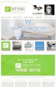 How cool is it that we were able to help one of our favourite stores re-brand themselves? We were thrilled to get the call from Ross Taylor, owner of Gabriel Ross, to help him create a new image/site for his online store, now known as GR Shop. Check out the website for yourself at: http://grshop.com/!
One of the most important factors in this project was maintaining a recognizeable connection to the old image, since Gabriel Ross has a large client base spread across the country. The other key element was the navigation. There is a lot of information on this site on a lot of different product types, so it was important to maintain consistency in how to access and display this information, as well as explore the entire site with ease – there’s more than just products for sale here, there’s a blog, and the ability to create wish lists and gift registries. With all that in mind, we also had to consider that this was also an e-commerce and content management site – which made the programming far more in depth.
Aug 16, 2012 | Project Updates
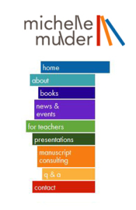 We were so happy to get the call from a dear friend of Meade Design Group, Mrs. Michelle Mulder, when she wanted a new look for her website.
We knew Michelle’s image would have to be fun and kid friendly (she is a children’s author), but maintain a professional look for the teachers and parents that would be using her website for resource materials, or for the professional clients who hire Michelle for manuscript consulting and copy writing.
We created a playful, abstracted version of a bookshelf in primary colours inspired by the series of vertical lettering in her name and continued the concept for the website’s menu.
We’ve posted her logo in our web and identity portfolios, but definitely check her website out for yourself at: http://www.michellemulder.com/
Jun 20, 2012 | Project Updates
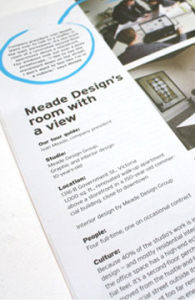 We are happy to spread the word that our studio was recently featured in a great design magazine – but not the kind we’re usually featured in…
For the May/June issue of DesignEdge – a leading Canadian magazine for Graphic Design, they wanted to tour some of the most beautiful, interesting and functional graphic design studios, and what better firm to feature than Meade Design Group? With us being a graphic and interior design studio we think we made for a pretty good entry in the issue!
The issue is out now, so be sure to check it out for a little something different for us – a new angle on our downtown Victoria studio!
May 1, 2012 | Studio News
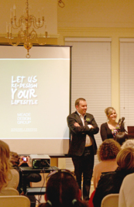 Our presentation at the Art Gallery of Greater Victoria’s ‘Let’s Talk Design’ Series was on Friday, and we are so pleased to report that it was a hit! We gave our lecture on ‘What Luxury Means Today’ to a sold-out crowd.
Thank you so much to all of the attendees, the Art Gallery, and of course our sponsors, Y.A.M. Magazine and Gabriel Ross, for your support of this event!
Our topic touched on everyday indulgences, where to invest in your home, pampering yourself, sustainability, and embracing your true style – make everything you do your own and live it with pride!
Thank you again for all of your support!
Apr 23, 2012 | Studio News
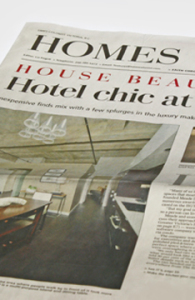 In anticipation of our presentation at the Art Gallery of Greater Victoria’s ‘Let’s Talk Design’ series, The Times Colonist has written an article on our recently completed interior design project at the Hudson, here in Victoria BC.
Many thanks to the writer, Grania Litwin, who interviewed us so carefully and really noticed all of the little details we incorportated into the project. She was able to keep the article focused on a strong belief of ours and topic for our presentation: it’s how you put things together, not how expensive they are.
We feel it’s a great representation of our project and teaser for our presentation at the art gallery next weekend – Our presentation is ‘What Luxury Means Today’ and will take place on Friday evening, April 20th at 7 PM – we hope to see all of you there!
Apr 14, 2012 | Studio News
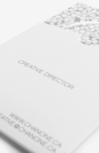 Creative Director Chanone Smith oozes class and sophistication in everything she does. Of course, she needed a fashion forward identity and stationery package to reflect that.
Inspired by fashion institutions, this has to be one of our favourite print jobs yet. The simple yet bold ‘C’ mark with the missing fragment is memorable and elegant. Her wordmark is no different, and places emphasis on the ‘Chanone’ to encourage clients to call her by her first name. An organic, animal print inspired pattern creates visual texture and interest against the main, crisp white background linking the stationery pieces together and adding another level of detail to her package. Custom stickers to seal the envelopes, metallic foils and a velvety laminated finish add tactile impressions to this stunning identity.
Please visit the identity and print galleries of our website to see the complete project.
Feb 22, 2012 | Project Updates
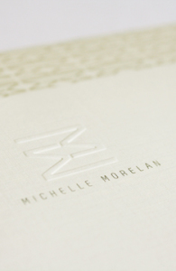 Michelle is a fellow designer that we already knew and loved, so when she approached us to design a new identity for her including logo, stationery, social media and website, we were thrilled.
Embracing Michelle’s personality and aesthetic, we created an identity that was warm, modern and clean – yet natural. Michelle Morelan Design is known for it’s West Coast Contemporary and nature-inspired interiors, as well as stunning renderings. The reflected ‘Double M’ used in her mark has been well received as both a bold, modern statement, and as evoking the natural reflections in the lakes and oceans Michelle experienced throughout her life living on the West Coast. This mark lends itself prefectly to creating gemoetric patterns and coupled with the taupes and charcoals we chose, fits Michelle’s style perfectly.
To learn more about Michelle Morelan Design, please visit the website: here
Jan 13, 2012 | Project Updates
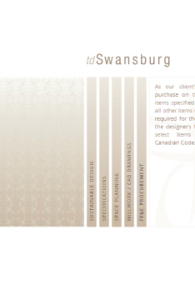
Another reason Meade Design Group is considered the ‘Designer to the Designers’: We have recently completed Vancouver and Victoria-based interior design firm, TD Swansburg’s website. We worked closely with founder and principal designer, Teresa Ryback on revamping her online presence to suit her aesthetic.
The addition of a brand new style of menu, soft gradients, subtle animations, and tons of content allowed TD Swansburg to showcase their designs in a whole new way. And the best part? The website was built using a content management system, so Teresa is able to edit and update the website text and photographs herself – including the integrated mini-blog ‘Chronicles’
To learn more about TD Swansburg, and view the website yourself, please visit http://www.tdswansburg.com/
Dec 20, 2011 | Project Updates
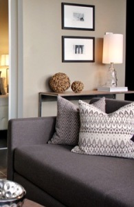 Meade Design Group is proud to introduce one of our recent interior design projects at The Hudson Building in Victoria BC.
An international tech company was in need of a suite where their executives could stay in the city without the need to book a hotel. The requirement was to design a home away from home on a short time line.
The executives for this company are mostly men and the inspiration was a masculine lodge blended with mid century modern influences.
Rust oranges, warm wood tones and geometrics add personality to this small space. For accessories we went for a mix of tribal and industrial elements.
Please visit the blog to see more photos and information. This project is also featured within the /showcase/”>’Showcase’ section of our Interior Design Gallery.
Dec 15, 2011 | Project Updates
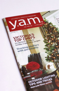
Looking for some tips and tricks to spruce up your usual holiday decor? Check out our latest appearance in Y.A.M Magazine!
Our principal, Ivan Meade has included some of his personal favourite ideas for making your home feel extra festive this time of year, including techniques he has used in his own home, and here at our studio. The article also features great suggestions from other local design industry professionals which made for a diverse selection of options and styles!
This issue is out now, so be sure to pick one up for yourself today! – your home will thank you for bringing new life to your Christmas tree, your mantle, your pillows, your entry, your table, and… well, you get the picture!
Dec 7, 2011 | Studio News
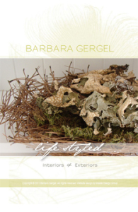 Barbara Gergel is a very talented and recognized local stylist. From residential to landscape design, Barbara’s ability to mix styles, deep knowledge of the design elements and a clear understanding of her clients needs are evident in each of her projects. Barbara’s designs have always been characterized by the elegance of their lines and a sense of uniqueness. Her work is often transitional with a perfect blend of classic and contemporary elements.
We created a design which we feel exudes class, flair and elegance with the use of a swooping peacock feather, clean typography, metallic inks and a chartruse colour palette which has been used on business cards and a one-page website.
Please visit Barb’s website at http://www.barbaragergel.ca/ and the identity, print and web galleries of our website to see the complete project.
Nov 14, 2011 | Project Updates
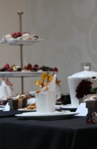 Meade Design Group was a little spoiled this fall, we were able to host the launch of Barbara Barry’s latest fabric collection, ‘Indochine’ with a private gathering of clients. We were actually the first showing in Canada so we feel very special to have been given the opportunity!
Of course, we have to thank Barbara Barry for creating the line, but many thanks also need to go out to all of our guests in attendance, Rook & Rose for the flowers and a great big thanks for the support from the team at Kravet Canada: Brian Donovan and Paul Smith, and of course our rep, Brenda Marks – we couldn’t have done it without her fabulous presentation!
There was an abundance of treats and drinks to be had, including our signature cocktail for the event ‘Indochampagne’. All in all, we’d say it was a great success! For more photos and information on the event, including our decor and signature cocktail recipe, check out our latest blog entry.
Oct 7, 2011 | Studio News
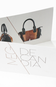 This is quite possibly our most fashion forward logo yet.
We were thrilled when international handbag designer Meg De Candia asked Meade Design Group to help her re-brand herself with a new logo, business cards, and an invitation/brochure design.
We wanted to create a look that would hold it’s own against heavy-weight brands such as Calvin Klein, Michael Kors, Balenciaga and Kate Spade. Not to toot our own horn, but we think we did with this clean but edgy logo with stong diagonal lines, juxtaposed directions and stacked typography. The logo also lent itself to a stunning use of repetition with her images and a beautiful custom pattern that was used inside the business cards and layered onto the image at the back of the brochure with a detail shot of the gorgeous hides she uses in her designs.
Please visit the identity and print galleries to see the complete project.
Sep 30, 2011 | Project Updates
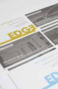 We cannot wait to share our most recent stationery and website package with you – Edge Architecture.
Founder of Edge Architecture Gaston Castaño [Maibc] came to Meade Design Group for an identity that would appeal to his design-conscious clientele. His company mantra? “The name EDGE recognizes the firm’s goal to provide a competitive edge to design practices that want to add value to their project deliverables”.
We went for it, with a bold lettering style and bleed that is most certainly eye-catching. The stationery was printed in four colours to maximize the punchiness of the Edge brand, and even features a die-cut to enhance the unique feature of the offset lettering within the logo. For more details go here.
To learn more about Gaston Castaño and his firm, please check out his website at: http://edge-arch.com/
Sep 22, 2011 | Project Updates
 Vic 42 is a local website that celebrates the unique and interesting people in Victoria – our pricipal, Ivan Meade, was invited to be part of their collection of personalities. He was very honoured to be selected and to share virtual space with some of the most influential people in our own community.
 7070 Design Headquarters is a new studio that has just launched in Calgary, Alberta. It is a place designers can go to use the resource library, hold meetings, and even rent out office space. A shared work space for Calgary’s design community.
 It’s that time again… the latest issue of The MDG Times has arrived!
 We were thrilled to work with Michelle Annette Kelava-Juszczyk on her unique business, Pacific Post Imports. A pop-up shop which brings in one-of-a-kind finds from all over the world, curated by Michelle herself who has been in the design industry for over 20 years. We’ll be adding Pacific Post’s print work soon, but in the meantime you can satiate your curiosity by checking out the website for yourself at:
  Meade Design Group’s interiors shall live on forever in hard cover form!!! We just got the book entitled Zen Style Residences where our interior design project “Marifield” appears within their glossy pages.
 How cool is it that we were able to help one of our favourite stores re-brand themselves? We were thrilled to get the call from Ross Taylor, owner of Gabriel Ross, to help him create a new image/site for his online store, now known as GR Shop. Check out the website for yourself at:
  We were so happy to get the call from a dear friend of Meade Design Group, Mrs. Michelle Mulder, when she wanted a new look for her website.
 We are happy to spread the word that our studio was recently featured in a great design magazine – but not the kind we’re usually featured in…
 Our presentation at the Art Gallery of Greater Victoria’s ‘Let’s Talk Design’ Series was on Friday, and we are so pleased to report that it was a hit! We gave our lecture on ‘What Luxury Means Today’ to a sold-out crowd.
 In anticipation of our presentation at the Art Gallery of Greater Victoria’s ‘Let’s Talk Design’ series, The Times Colonist has written an article on our recently completed interior design project at the Hudson, here in Victoria BC.
 Creative Director Chanone Smith oozes class and sophistication in everything she does. Of course, she needed a fashion forward identity and stationery package to reflect that.
 Michelle is a fellow designer that we already knew and loved, so when she approached us to design a new identity for her including logo, stationery, social media and website, we were thrilled.
 Meade Design Group is proud to introduce one of our recent interior design projects at The Hudson Building in Victoria BC.
 Barbara Gergel is a very talented and recognized local stylist. From residential to landscape design, Barbara’s ability to mix styles, deep knowledge of the design elements and a clear understanding of her clients needs are evident in each of her projects. Barbara’s designs have always been characterized by the elegance of their lines and a sense of uniqueness. Her work is often transitional with a perfect blend of classic and contemporary elements.
 Meade Design Group was a little spoiled this fall, we were able to host the launch of Barbara Barry’s latest fabric collection, ‘Indochine’ with a private gathering of clients. We were actually the first showing in Canada so we feel very special to have been given the opportunity!
 This is quite possibly our most fashion forward logo yet.
 We cannot wait to share our most recent stationery and website package with you – Edge Architecture.